Thingtesting
Thingtesting is essentially a brand marketplace that helps consumers shop better and brands are better. No other review solution focuses on today's online shoppers' specific needs and values.

Results
Data after design changes
Total Visits
525.6k
+8.21%
Bounce rate
52.6%
-11.29
Pages per visit
3.8
+65.22%
Average duration
00:01:58
+21.65%
After the design went live, we reviewed the Google analytics:
Bounce rate decreased by -11.29%
Page per visit increased by +65.22%
Average duration increased by +21.65%
Thingtesting also saw an increase in affiliate marketing earnings. This was generated through users visiting brand sites through Thingtesting. This subsequently increased 'claimed brands' (brands that claimed their Thingtesting brand page and therefore approved the page as a verified source of reviews.
Problem
Thingtesting was experiencing a fast-growth in their early stages of launch and needed to improve their UX in order to retain visitors and convert them. One of the priorities was to improve the retention, engagement and conversion of the brand page UX.
Research
Card Sorting
Thingtesting had community of the early adopters of their product so we utilised them by conducting a card sorting session that would allow us to see the features that they wanted to 'keep' and the feature that wanted to add. This would then determine the rest of the project. This considered the whole platform but we would then decide which elements could be considered for the brand page. Any features not of the list were either removed or deprioritised.
Keep
Brand images
Rating
Discount codes
'Spotted by' tag
Add
Additional images
Individual product placements
'Want to test' interaction
'Claimed brand' interaction
Ability to search brands
Ability to compare brands
Google Analytics
The reason the brand page was one of our first priorities to address in terms of redesigning was because when we looked at the Google analytics, we could see that the journey look like this:
Step 1: User searches for brand in Google (e.g. Heights supplements)
Step 2: User clicks on Thingtesting brand page (e.g Heights supplements brand page)
Step 3: User explores the rest of the site, the next most popular page was the brand directory
Learning:
What we discovered is that users were not introduced to the site via the homepage (as they usually would with any other website). They were technically be entering the website through the backdoor and working their way around from there so we decided to prioritise the brand page and treat it as if it was the homepage.
Customer Profile
Upon starting the project, I talked with the founder, the marketing executive, and the Community lead to clarify who the user was. From these conversations, I discovered that the Thingtesting customer is someone who is:
Curious
Loyal
Inspired
Data-driven
Research Survey
The theory that the brand page was going to be the point of conversion was further highlighted by a user survey we conducted. We created a 10 question survey and our findings were as follows:
Users felt like the brand page did not offer enough information for them to make a purchasing decision, they still had to source other websites for more detailed information on the brand.
Users felt like it was easy to find brand they knew but challenging to discover new brands and this affected the frequency of their visits to the website.
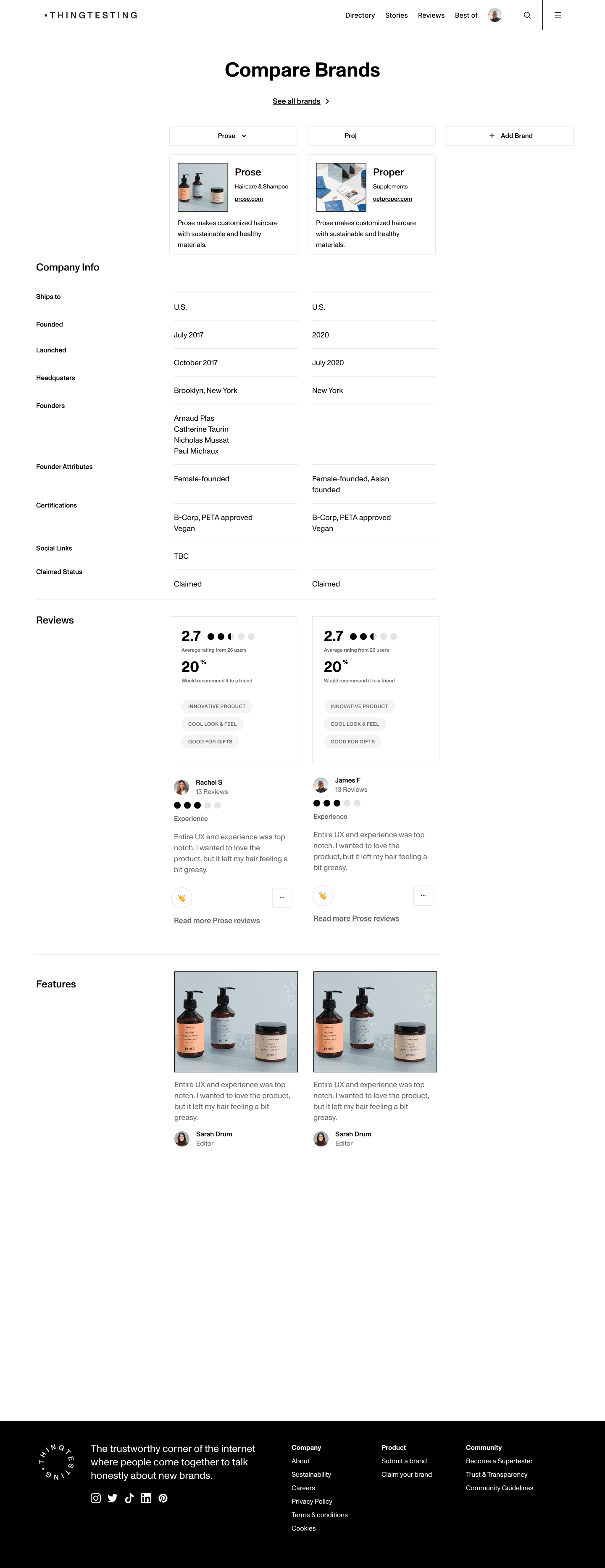
Users wanted to be able to compare brands. Users were frustrated by the idea of opening up multiple tabs and switching to compare products.
As well as this, we got basic information about their economic status so we could build comprehensive user personas.
User Testing
In addition to the research survey, I also carried out a usability test session over Zoom to confirm our theories about the homepage vs brand page importance. I told the focus group that they had 10 mins to browse Thingtesting, I intentionally gave them no further instructions so we could see where their natural interested lied.
Our findings after the session:
7/8 users completely ignored the homepage (didn't scroll down) and navigated straight to the brand directory (which was presented on the top navigation).
9/10 users spent more time on the brand page compared to any other site of the website
6/10 users visited the brand page a second time
This confirmed our theory about the homepages level of importance to the user but also introduced the idea of setting the brand directory as the homepage so users could land on the site and immediately start exploring our library of brand.
Data before design changes
Total Visits
485.7k
Bounce rate
59.3%
Pages per visit
2.3
Average duration
00:01:37
Competitor Research
Jacobs's law suggests that users spend more time on websites they are familiar with than one that is different. So, I looked into existing review and comparison sites to ensure the UX was of a familiar format.
Google Reviews
Focus:
Local businesses
Moderation:
Known for spam reviews and favours consumers over businesses.
Pricing:
Free for businesses and consumers
Benefits:
Boosts brand SEO
Trustpilot
Focus:
E-commerce, tech, and service-based businesses.
Moderation:
Has features that allow businesses to manage reviews
Pricing:
Free for businesses (limited features) and consumers
Benefits:
Offers widget integration and review invitation tool
Yelp
Focus:
Hospitality and local businesses
Moderation:
Has a structured filtering system that sometimes hides genuine reviews as 'Not Recommended'
Pricing:
Free for businesses and consumers
Benefits:
Offers features like bookmarking, messaging and booking
Learnings
The competitor research solidified Thingtesting's position in the market as there really was no other brand that was catering to modern e-com brands. There were also some feature suggestions we took from the research too:
We needed to create trust between the consumer and the brand. This meant not 'filtering' or allowing brands to 'delete' reviews from the brand page. However, this meant we added guidance on how to write a 'useful' review and we required the user to identify their relationship to the brand whether they were an employee, customer or investor. Thingtesting of course moderates the reviews but the key piece was transparency.
The second learning was to make the platform free for consumers and brand, this encouraged full engagement from both parties. But for businesses that wanted to access further features like community access, shopper insights and retail support, there would be a fee.
The last learning was around brand awareness and the best way for Thingtesting to do this was to create an integration that brands could embed onto their site (something like Google and Trustpilot allow)
User Personas
Once, I gathered information from the team and a few of the most engaged users. I was able to pull 3 types of customers.

The Discoverer
The discover uses Thingtesting to find what competitors are doing and how people react to their products. They also use Thingtesting to get inspiration from other brands on Thingtesting to see if they can replicate the same strategies.

The Researcher
The researcher uses Thingtesting to share her challenges and/or successes with products featured on Thingtesting. They love to interact with other users who have purchased similar products and brands and they want to support products with a smaller platform the backing, they deserve to raise awareness of them.

The Skeptical Consumer
The skeptical consumer wants to find a brand that offers the 360 experience. Including a great brand story, seamless online experience and great aftercare. They will want to find a sustainably conscious brand. It doesn’t have to be 100% sustainable, but the brand needs to be aware of its impact and transparent with the consumer.They will want to find a product that works and is backed up by existing users. Lily is willing to spend a little more than she intended if it means hitting these points.
Design Process
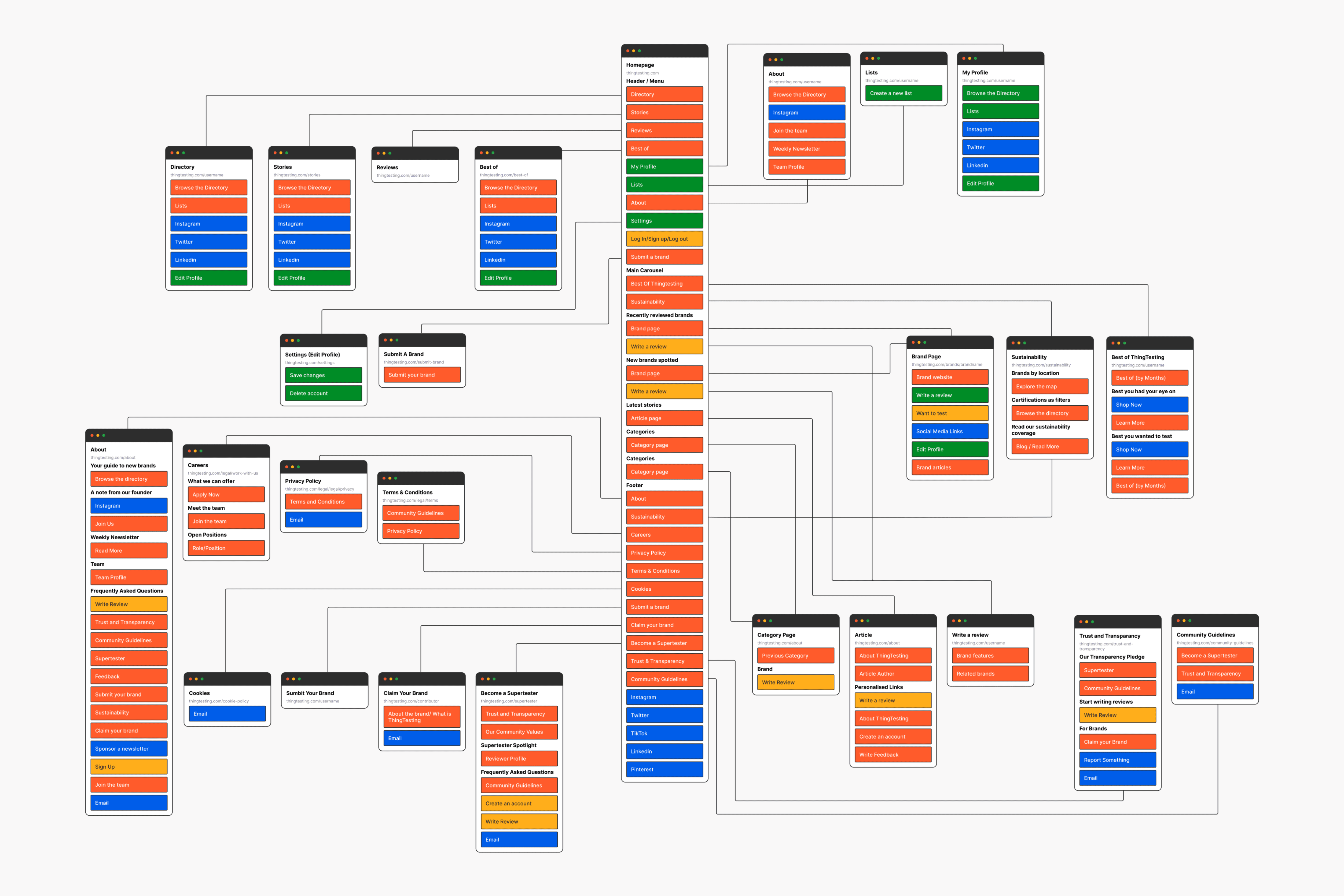
Site map
The Thingtesting website was a product of multiple iterations so we worked with this site map to make sure that the flow make sense to the user regardless of what journey the user followed.
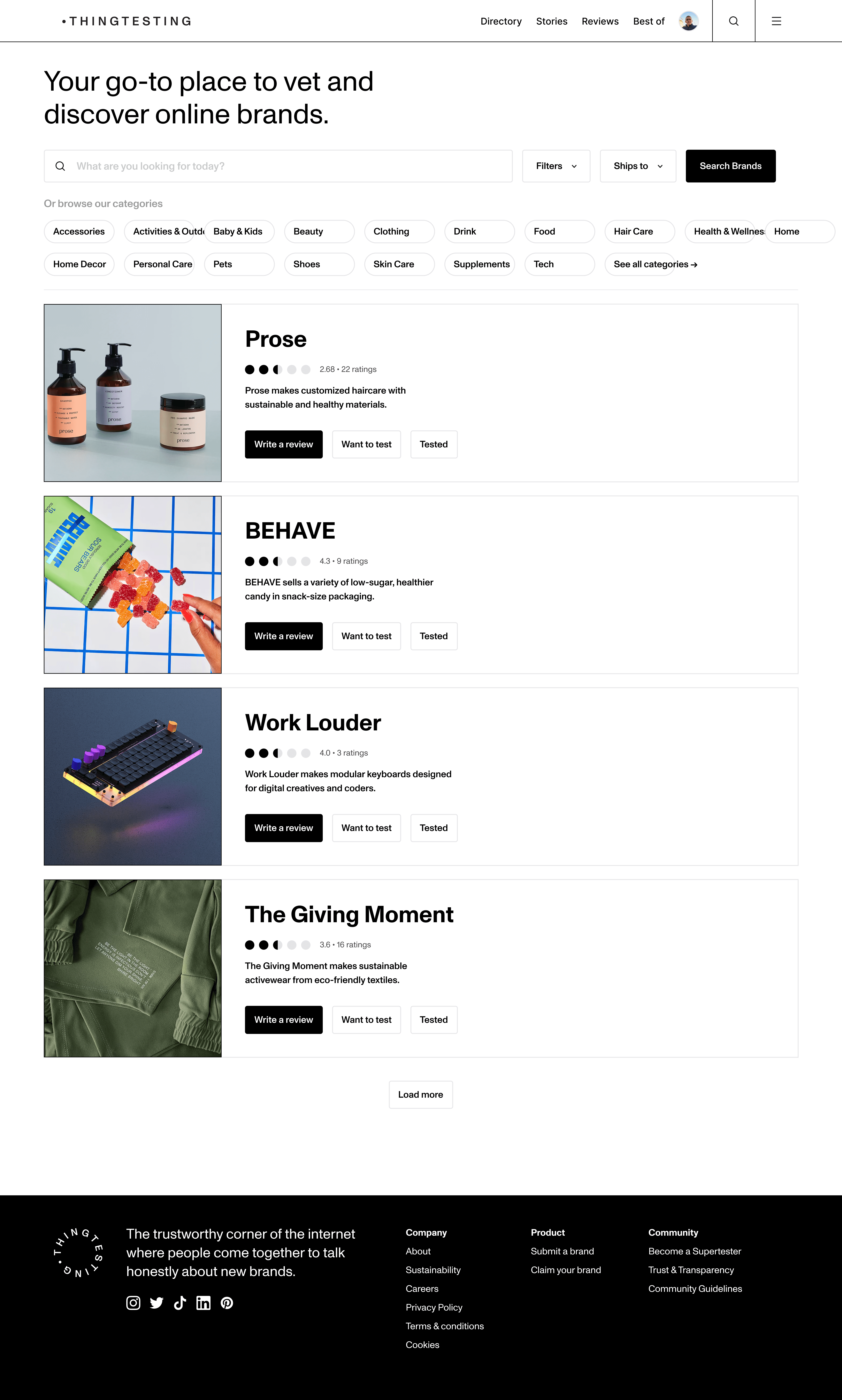
Wireframing
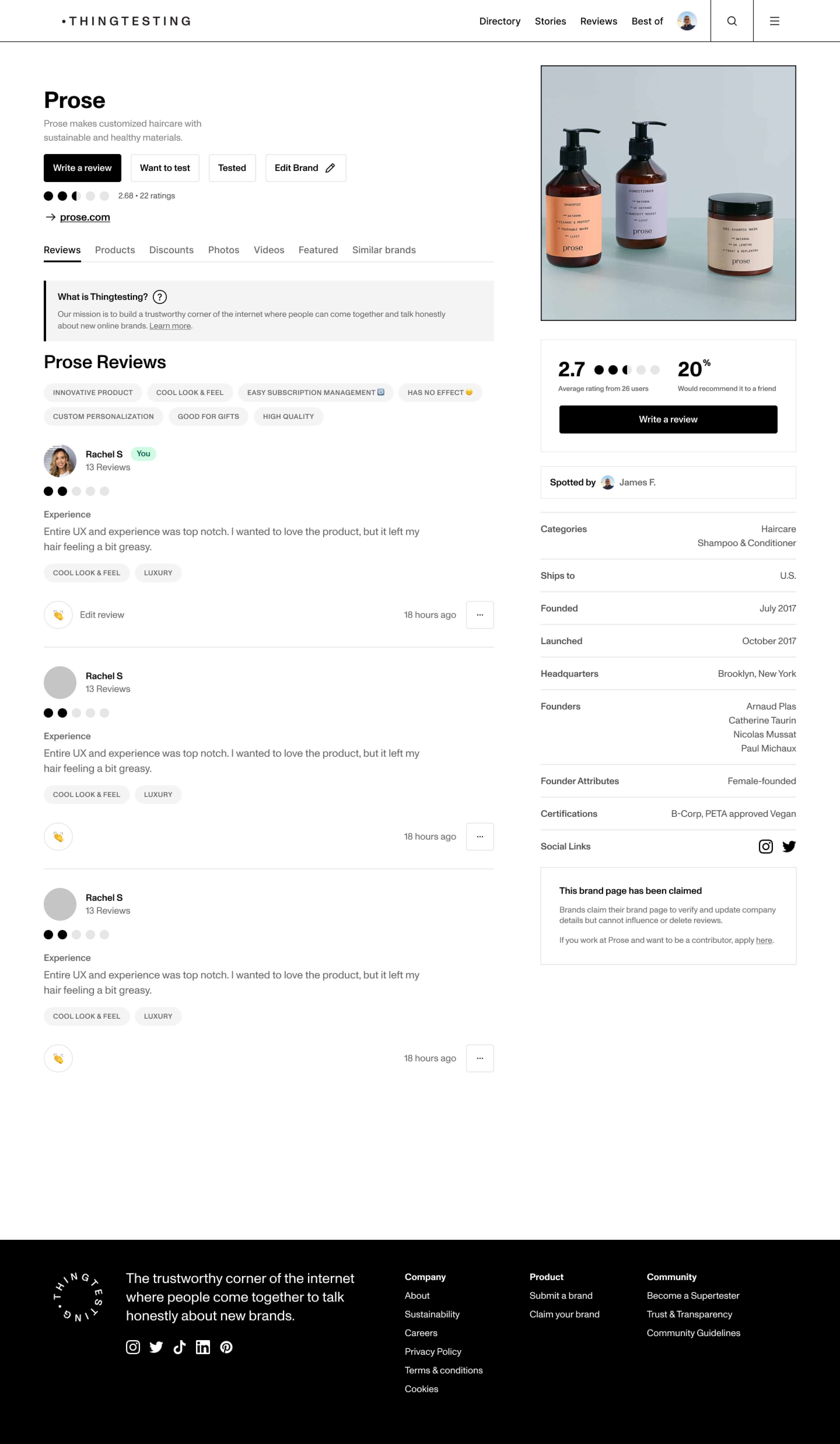
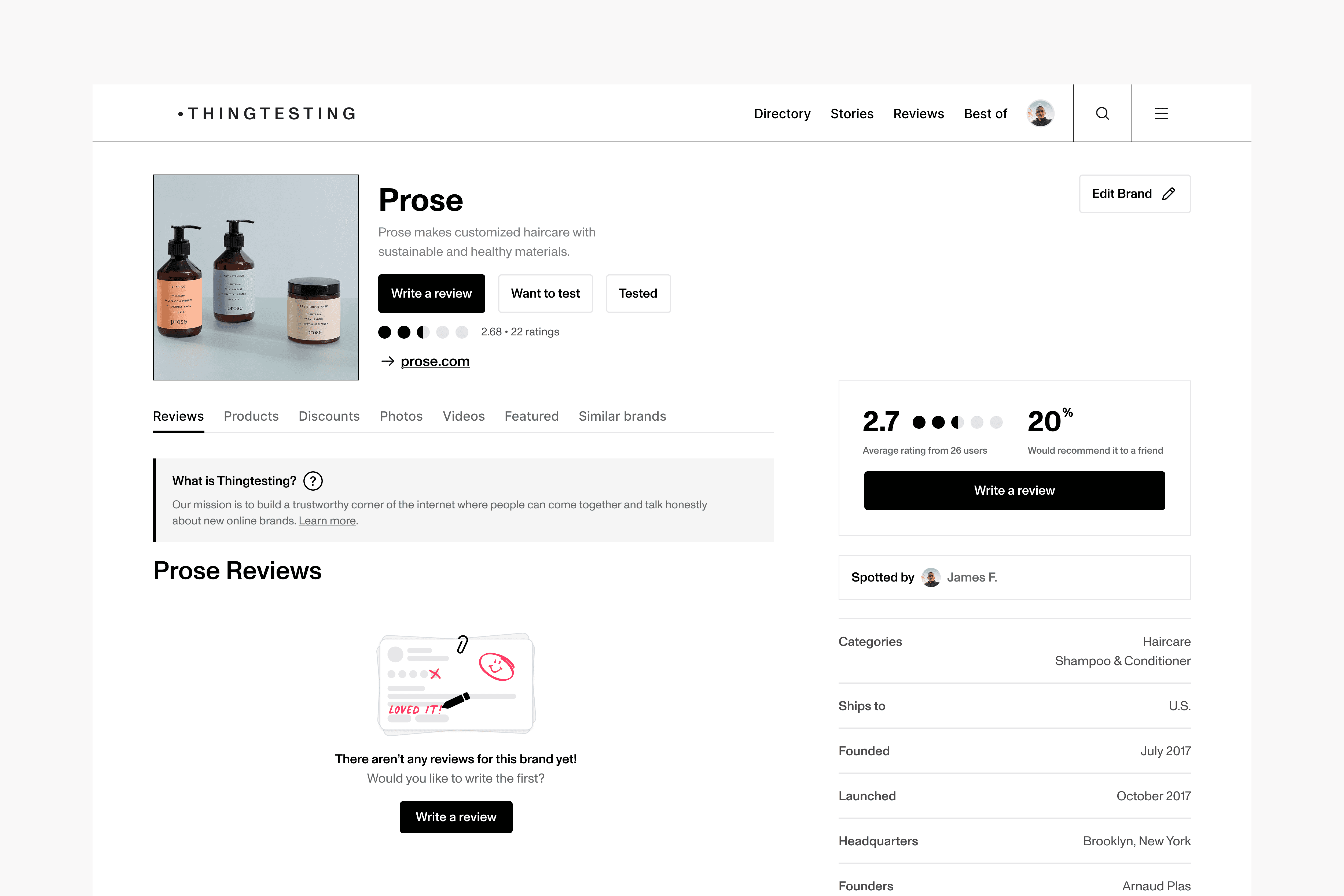
The wireframing stage consisted of iterating 3-5 versions of the brand page. The final features of the brand page included all the features suggested from the initial card sorting exercise.
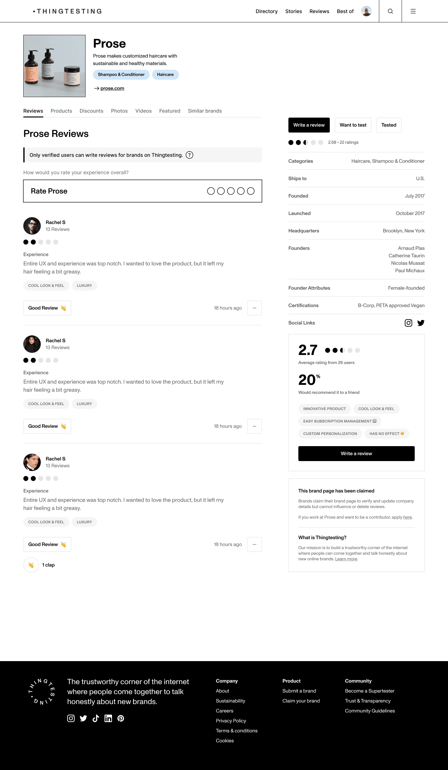
Final Product
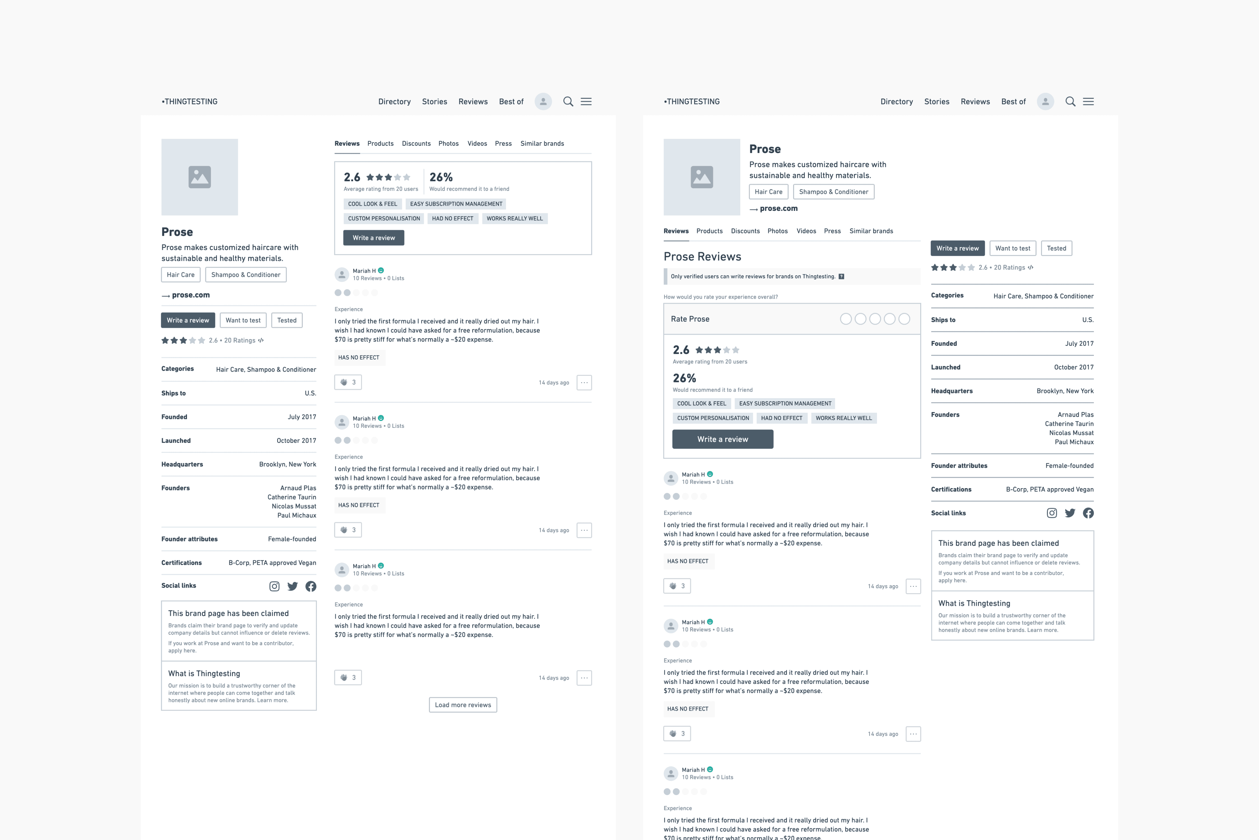
A/B Testing
For the final design we landed on two options, the team liked both and thought there were benefits to each layout so we decided to A/B test the below screens. The goal for this page was to get the user to engage with the brand (by clicking on their URL) and ideally writing or engaging with the reviews.
However, after launching we realised that we needed to design an empty state for brands that had not yet received reviews
Design Elements
Font
Heading
Heading 1
ABC Monument
Regular
32px
160%
Heading 2
ABC Monument
Regular
24px
160%
Heading 3
ABC Monument
Medium
20px
160%
Heading 4
ABC Monument
Medium
18px
160%
Body
Body 1
ABC Monument
Regular
18px
160%
Body 2
ABC Monument
Regular
16px
160%
Body 3
ABC Monument
Regular
14px
160%
Body 4
ABC Monument
Regular
12px
160%
Colour
Brand
Black
White
Bright Pink
System
Charcoal
Grey
Background
Critical
Dark Yellow
Light Yellow
Success
Dark Green
Light Green
Warning
Dark Red
Light Red
Main Components
Input Fields
Text Fields
Placeholder text
Text Fields
Placeholder text
Text Fields
Placeholder text
Dropdown Fields
Text Fields
Placeholder text
Text Fields
Placeholder text
Item 1
Item 2
Item 3
Text Fields
Placeholder text
Icon Fields
Text Fields
Placeholder text
Text Fields
Placeholder text
Text Fields
Placeholder text
Buttons
Placeholder text
Placeholder text
Placeholder text
Placeholder text
Placeholder text
Placeholder text
Brand Page Header
Variable 1
Image
This is where we will write a brief brand description.
Category
brandname.com
Variable 2
This is where we will write a brief brand description.
Write a Review
Want to Test
Tested
Edit Brand
3.0
22 reviews
-> brandname.com