Trips IP
Trips is a first of its kind platform providing content creators with the ability to safeguard at track the copyrights of their content.

Results
The features are still in development so there has not been mass testing. However, this has been demo'd to investors and has initiated investment.
The prototype can be accessed here.
Problem
As Trips planned their their product expansion, I was briefed to upgrade the dashboard to include features that would enable users to:
Upgrade their account to 'Premium'
Download content from the dashboard
View user onboarding status
Research
User Testing
The platform currently has just under 100 content creators using it so I reached out and got ~15 users to provide us with in-depth feedback about their experiences using the platform.
Initial user testing feedback gave us a couple of those to develop including:
Usability: Initial user testing sessions shone a light on the products complex nature. As this is a new product and process for most users, they wanted it to feel more intuitive and familiar.
Language: As with any MVP product, it had been developed by people who were very close the product and very knowledgable in the industry; meaning the language used was not familiar to the regular content creator.
Feature optionality: Users wanted all the 'need-to'know' features available from the dashboard. With guidance on how to use them. They found that features hidden within 'settings' or other pages were easy to forget about.
I worked with the brand and product teams to clarify the solutions and prioritise accordingly, thais started with going back to the user flow and ensuring these features were prompted in the correct area of the users journey.
Design Process
Deliverables
After our focus group we clarified the deliverable would be:
Updated dashboard header:
Highlighting any 'next steps' the user needs to take
Showcasing features even if they are in the premium model
Using colour theory to indicate status' of interactions as well as copy
Guidance on how to make the most of the platform
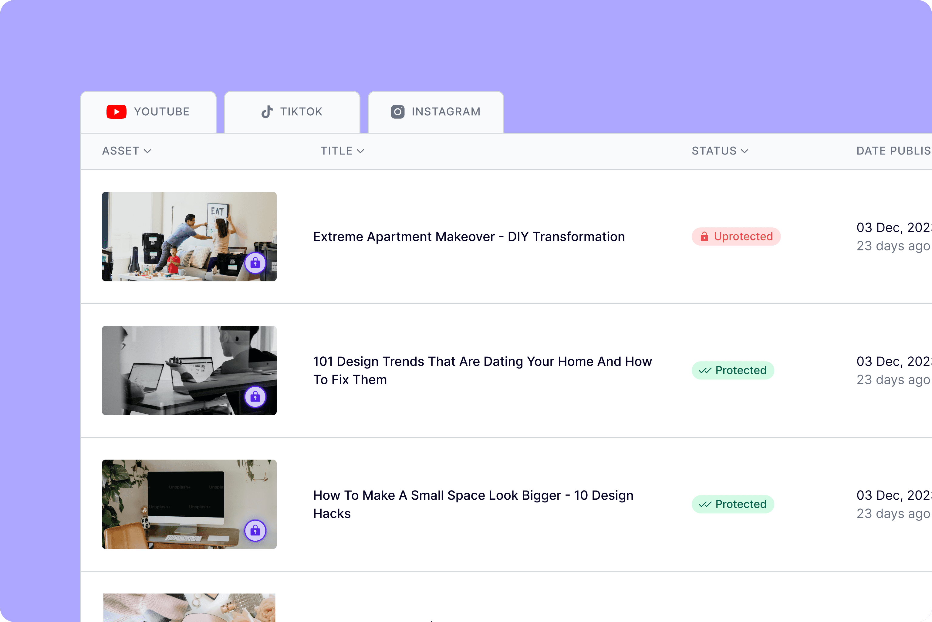
Refined table of content
We workshopped as a team to identify where we wanted these features to live and be accessed. Based on the user feedback this needed to be as intuitive as possible.
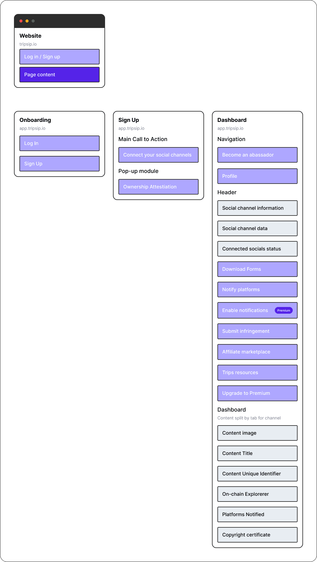
Site Map
The first step we wanted to take was to relook at the site map to ensure the feedback was integrated into our user journey. It was also a good tool to use to community the journey changes to the developers.
Wireframing
Common feedback that we received on the previous iteration is that users didn't want to think when using the platform, they want their experience to feel intuitive and seamless, so it was important for us to clarify the users choices with Hicks Law so they could make quicker decisions that didn't use up too much brain power.
High-fidelity
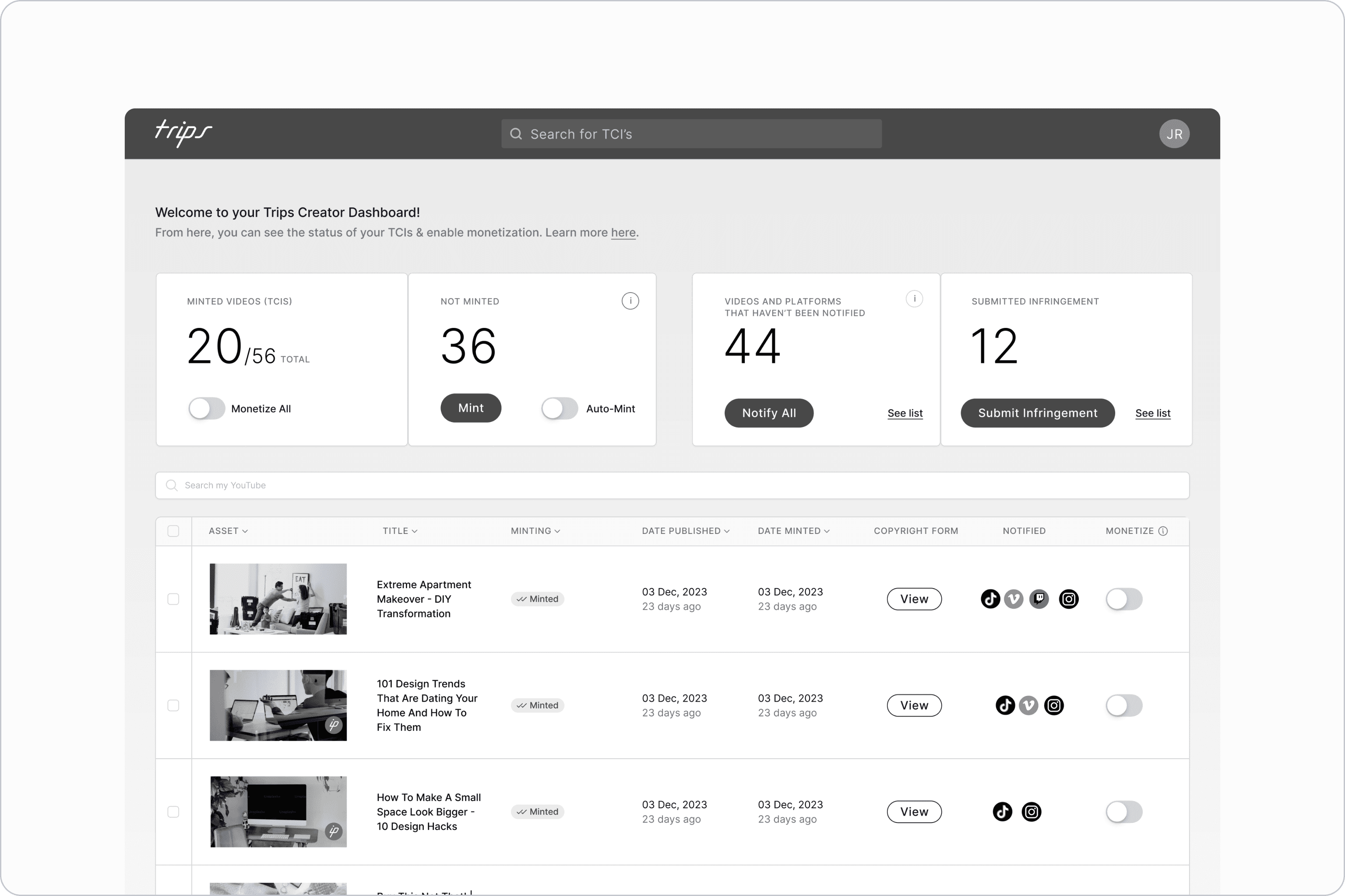
Before curating this new dashboard, the Trips dashboard was in its MVP state. We had just designed enough to show investors and guage the market. Now, we are expanding the product offering and developing the product to cater more to the users problems.
It was decided that alongside the planned updates, we needed to showcase a few more data points to the user. The idea was that this would keep them engaged in the product and their content. The finalised data points included:
Number of verified videos
Number of non-verified videos
Number of platforms aware of verified videos
Number of emails sent to platforms
However, we shared this version of the screen with 12 of our most engaged creators and discovered that they didn't find that information useful.
8 out of 12 of the users wanted more guidance/hand-holding on the dashboard
11 out of 12 of the users felt like the data didn't add to their experience or encourage them to engage
6 out of 12 of the users shared that they needed more colour interaction to visually understand the statuses of certain items
Based on this feedback, we went back to the drawing board and redesigned the dashboard to guide the user as opposed to informing the user.
I then went away and worked on building the high fidelity screens that I was then able to present back to the team.
During this phase, I went back and forth on the design a lot. There was a battle between getting the right balance of what the founder saw the product as vs what the user actually wanted.
This is something I find is always a challenge with early stage product ideation.
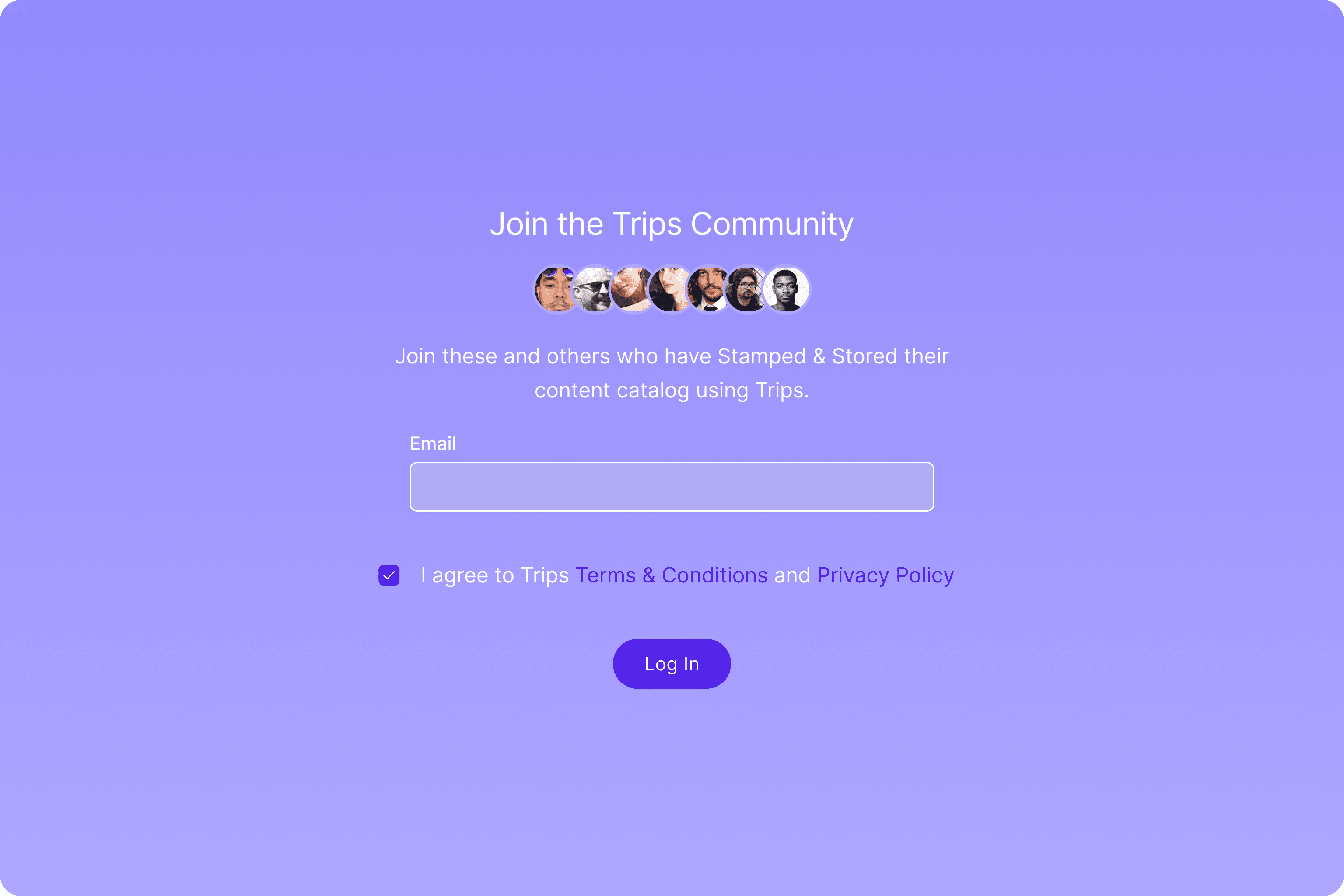
Onboarding
We realised that the platform really started from the onboarding and to elevate the intuitivemness of the user journey, we had to start from there. Trips required 3 levels of authorisation from their customers before entering the main platform. This is a high friction point for a SAAS product as the users is giving more than they are receiving. In order reduce the bounce rate within the user journey we applied the goal-gradient effect which uses opacity to reduce the cognitive load of the user.
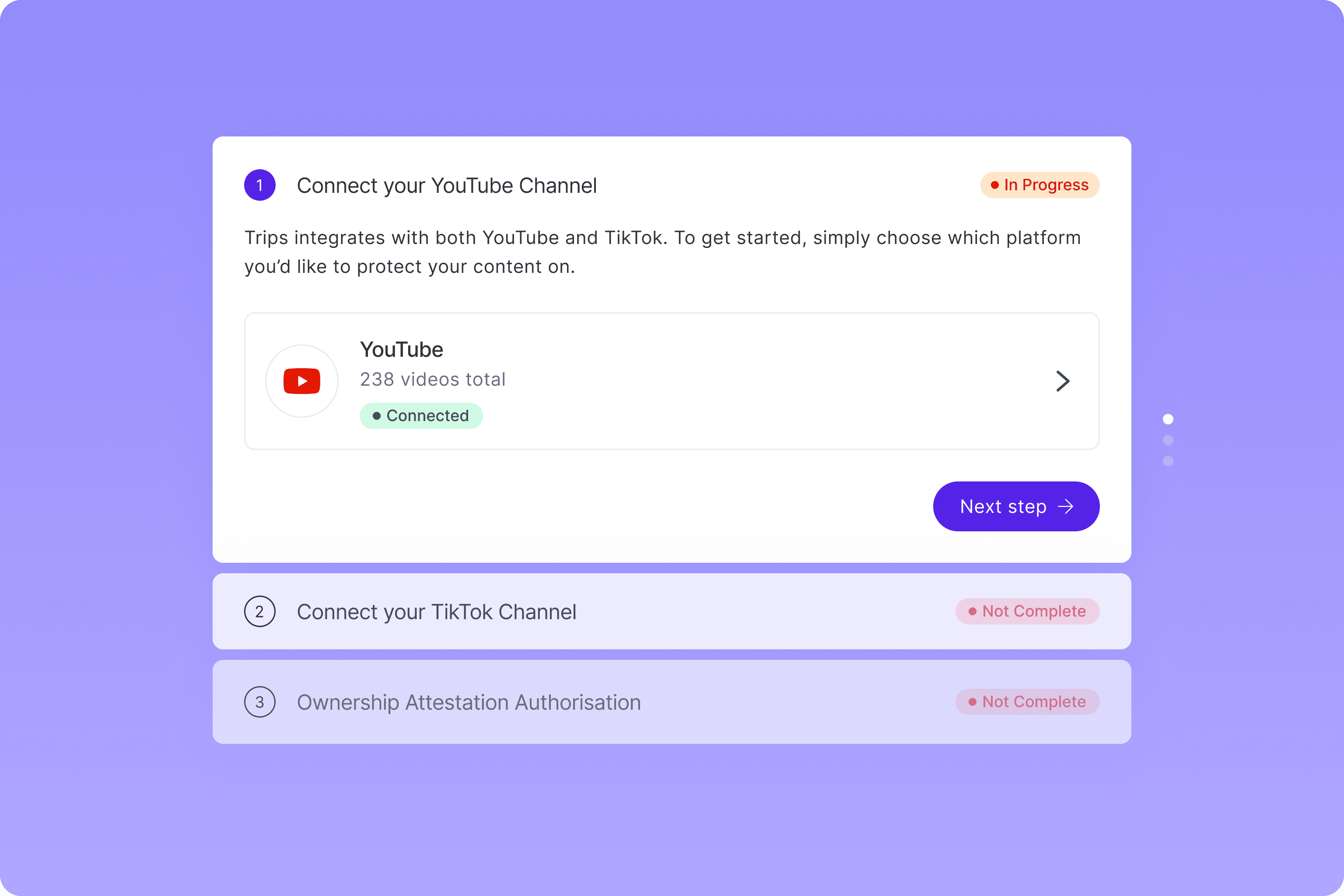
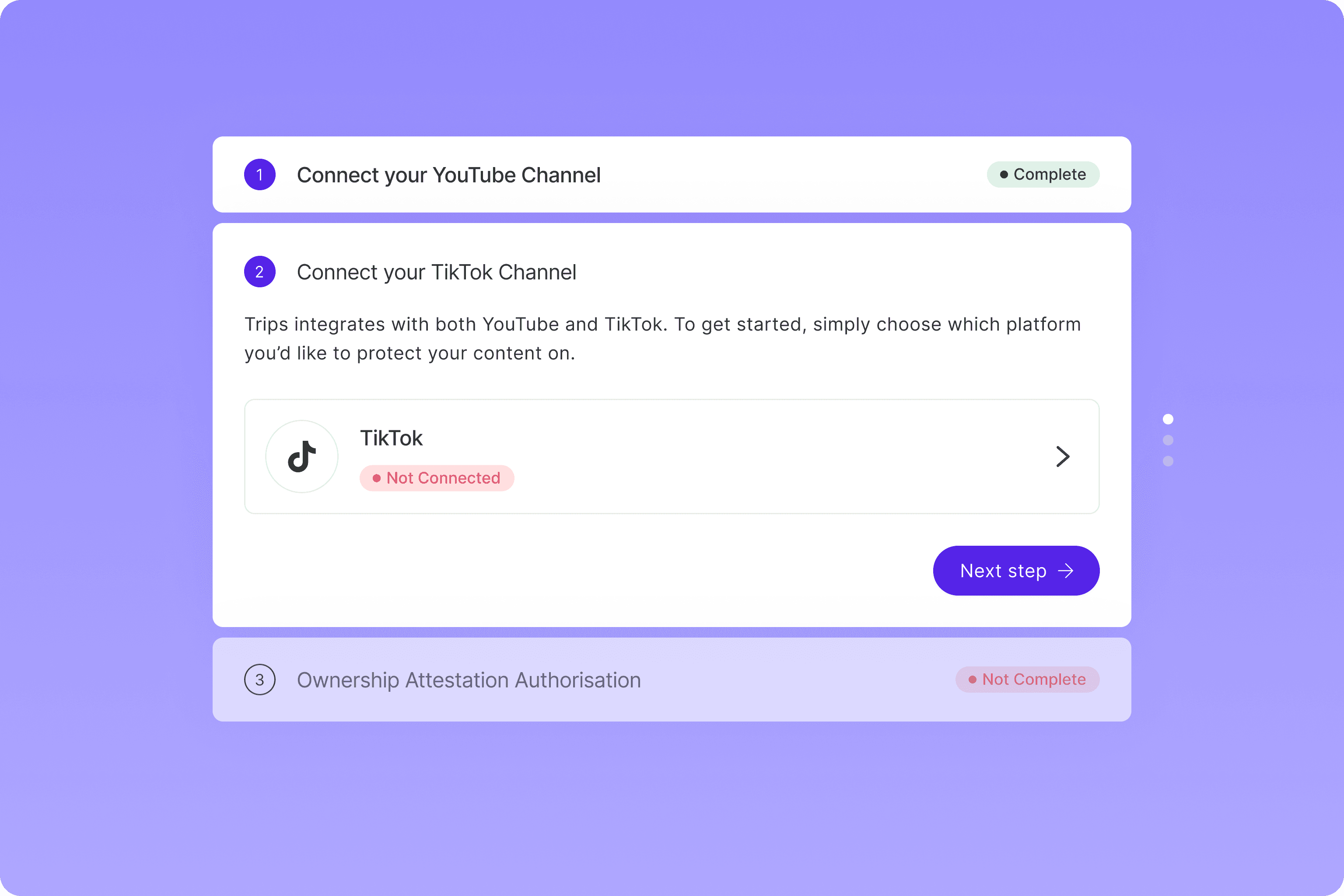
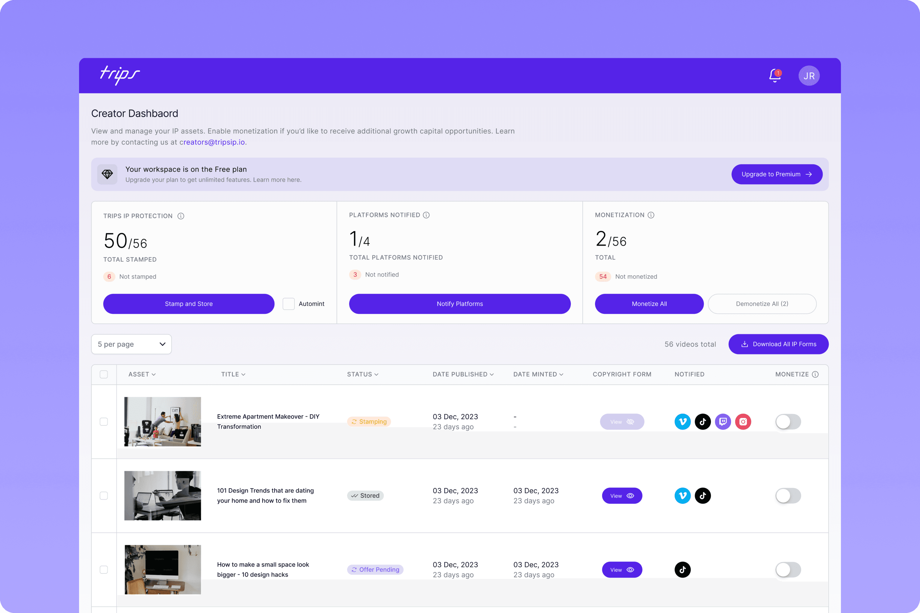
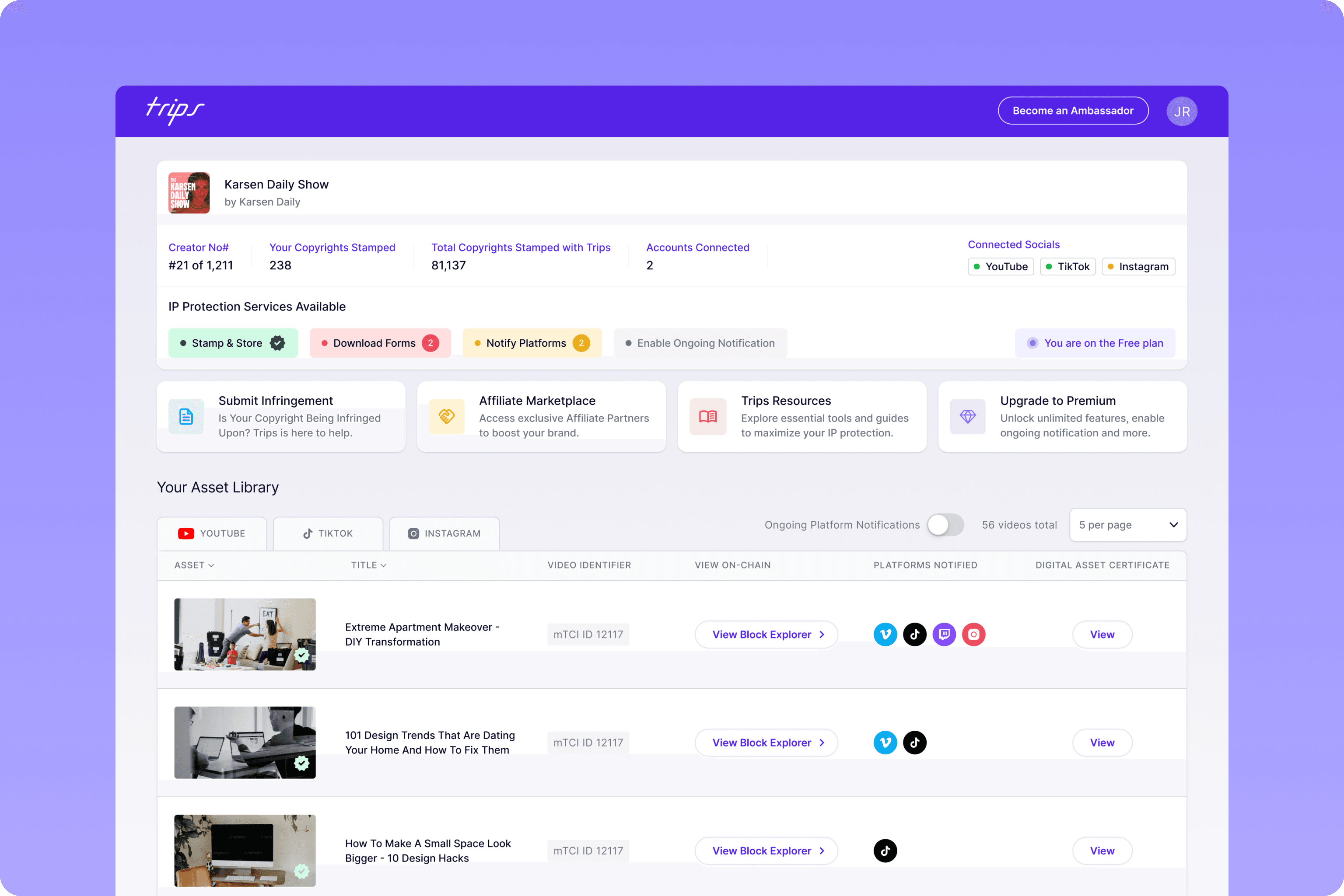
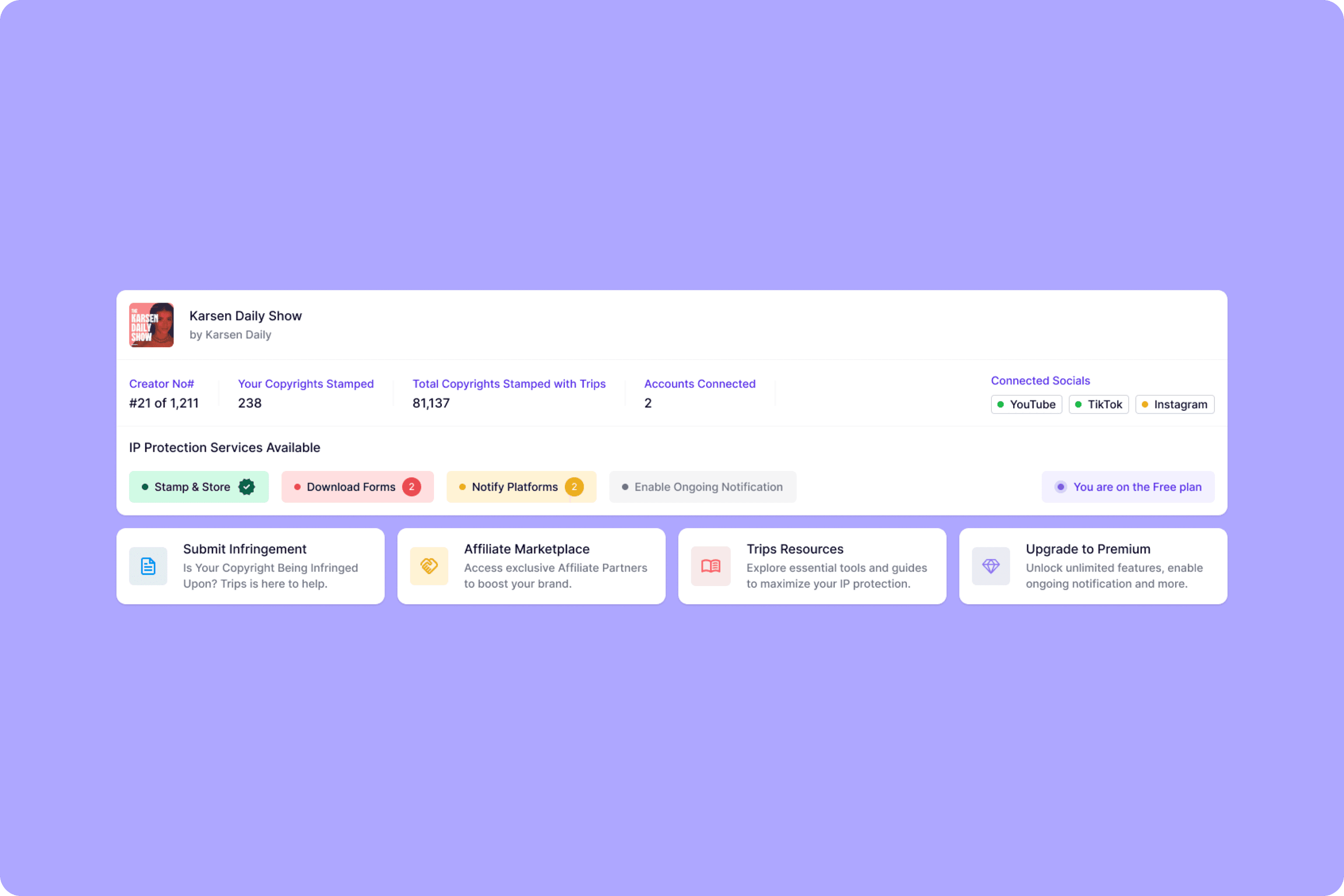
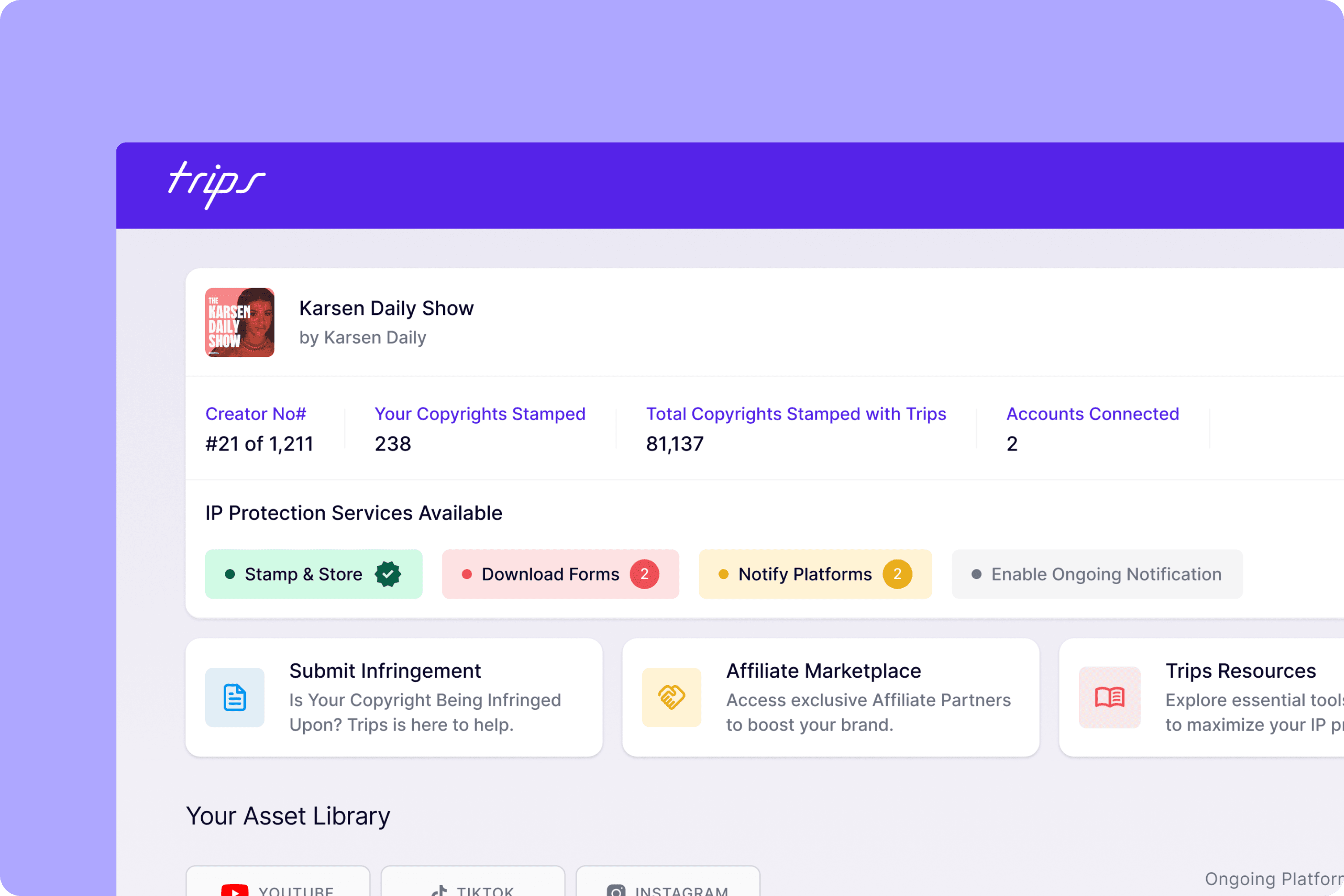
The Dashboard
The revised version of the dashboard was warmly welcomed by the focus group and was described as "so much more user friendly" and users were "excited to start using this version".
Millers Law shares that users can only really focus on 7 items on a screen (plus or minus two) so this was a consideration when mapping out the items we wanted on the initial dashboard screen. The trips dashboard is comprised of 6 cards, all containing information that will helps them engage or help guide them.
We introduced the traffic light colour system to ease the understanding of items that needed action now or later which will again, encourage users to engage in any outstanding task. The shade of red used is the same shade used across Instagram and TikTok so there is a sense of familiarity when it comes to the behaviour required when this colour is shown.
The 4 cards sandwiched between the header and the table are also ordered in a specific way that will hopefully engage users in the interaction we need the most. According to The Serial Position effect, users remember the first and last item in a series which is why we placed the 'submit infringement' and 'upgrade to premium' call to actions at ether end. The lesser important CTAs are then placed in-between.
Prototyping
Once all high-fidelity screens were approved, we worked to build a prototype that could be used as a demo for investors and also for any customers that wanted an insight into the brands upcoming features.
Final Product
The final solution ending up being an upgrade of the top third of the dashboard.
We were able to:
Link the users Google account to showcase a display photo and name
Show social account connection statuses
Show key asset data
Highlight important call-to-actions
Feature a visual onboarding process
Include four key product features as cards
Design Elements
Font
Heading
Heading 1
Inter
Regular
32px
160%
Heading 2
Inter
Regular
24px
160%
Heading 3
Inter
Medium
20px
160%
Heading 4
Inter
Medium
18px
160%
Body
Body 1
Inter
Regular
18px
160%
Body 2
Inter
Regular
16px
160%
Body 3
Inter
Regular
14px
160%
Body 4
Inter
Regular
12px
160%
Colour
Brand
Dark Purple
Mid Purple
Light Purple
System
Charcoal
Grey
Background
Critical
Dark Yellow
Light Yellow
Success
Dark Green
Light Green
Warning
Dark Red
Light Red
Main Components
Input Fields
Text Fields
Placeholder text
Text Fields
Placeholder text
Text Fields
Placeholder text
Dropdown Fields
Text Fields
Placeholder text
Text Fields
Placeholder text
Item 1
Item 2
Item 3
Text Fields
Placeholder text
Icon Fields
Text Fields
Placeholder text
Text Fields
Placeholder text
Text Fields
Placeholder text
Buttons
Placeholder text
Placeholder text
Placeholder text
Placeholder text
Placeholder text
Placeholder text
Badge
Green badge
Yellow badge
Red badge