Wellbeing App
Reed wellbeing app is a software solution sold to health care systems to manage the basic wellbeing of their clients including weight management and smoking habits.
Results
As a result of this new app
The company reported an increase in customer satisfaction scores
An increase in white-label sales
MegaNexus employees say "it makes my job so much easier because it practically sells itself"
MegaNexus customers report that users are more engaged
Problem
This problem that ignited this project was that Reed was getting feedback from their existing customers that the platform felt outdated amongst other complaints.
Below are some quotes from the feedback received:
"We are having to sign more time into training users how to use the product because it's not intuitive or feels outdated vs the software our users are used to."
Customer 1
Customer for 2 years
"We have had some feedback from our users on additional features that they believe would help keep them more motivated to use the platform."
Customer 2
Customer for 4 years
"Every year, the product becomes harder to user. The wellness industry is moving and at a fast rate, we need to be able to keep up and offer our users a product that feels familiar.
Customer 3
Customer for 8 years
Research
Customer Profiles

MegaNexus
Software Solution Company who licenses software to government backed companies.
Location:
London, UK
Bio:
MegaNexus is the creator of two softwares, 'Captr' and 'Geanie'. They license these softwares out to government backed business across the uK while providing options for customisation.
Frustrations:
Over the years, with the increase in software aesthetics, MegaNexus has seen several red flags that have encouraged them to invest into the UX UI of their products:
Sales have dropped by ~11% each year since 2020
The sales team have shared that not only have their sales calls increased in time but they also require more calls to get a sale over the line
From companies that don't buy from the sales team, the feedback has been "we love the idea of the software but we don't see this software as something would adopt longterm because it's not well designed"
Needs:
A new UX UI for their softwares so they can
Decreases the number of sales calls
Decrease the duration of sales calls
Increase sales YoY
Receive positive customer feedback
Reed Wellbeing
A company that has a lot different cuttomers arms, including their wellness offering.
Location:
London, UK
Bio:
Reed Wellbeing is a company that is looking to improve the health of people via their employers. They use science backed evidence to provide a personalised solution for people looking to lose weight, stop smoking or fighting disease.
Frustrations:
Based on our feedback from Reed Wellbeing there were a number of factors affecting their experience with Captr.
They were having to sign more staff to train users how to use the product
Reed staff felt like they were wasting a lot of time teaching new users have to integrate their goals onto the app
Needs:
Reed Wellbeing needed:
An intuitive platform that was easy to adopt
User set up guides and videos that could be sent to any new users

Laura, Reed Wellbeing User
Users within government service systems that are looking to improve their health.
Location:
Metro cities in the UK
Location:
London
Bio:
Laura is a Reed Wellbeing user. She gained access through her employer and has decided to use the software to help her lose weight.
Frustrations:
Based on her initial interactions with the app Laura has found that using the app feels like a chore.
It's not easy navigate
It's not encouraging or motivating
Its hard to track her goals
It's not aesthetically please, so there's not an intense desire to interact with it.
Needs:
Laura need an app that
Is easy and simple to navigate
Encourages and motivates her to meet her goals
Reminds her of specific tasks that she need to do to meet her gaols
Looks and feels like all the other software she uses
Focus Group
We set up a focus group where we asked questions for each section of the app. We briefly describe the interactions on the page and then left the floor open for feedback
Which areas of the app were the selling points for license customers
Which areas of the app were thought of a 'irrelevant' for license customers
What were some common points of feedback from license customers
This would give us a give direction for points of improvement that would benefit the license customer.
Focus Group Stats
Location:
Teams
Attendees:
# of Questions
18
Results
55% of users found the navigation confusing, indicating a need for improvement in this area. Additionally, 40% of users mentioned difficulty in finding resources, suggesting that the app's information architecture may need refinement.
33% of users said the dashboard is the most engaging area of the app. This suggests that the dashboard design is effective for a portion of users, but there may be room for improvement to engage a larger percentage of the user base.
35% of users expressed the need for more customizable options in their profiles. This feedback highlights a desire for personalization, which could enhance user satisfaction and engagement with the app.
Summary
Based on these focus group outcomes, consider the following improvements for your wellness app:
Simplify the navigation structure to reduce confusion.
Improve the accessibility of personal logs within the app.
Maintain the current color scheme and overall design, as it's well-received.
Enhance the dashboard to make it engaging for a larger portion of users.
Implement more customization options for user profiles.
By addressing these areas, we can improve the user experience and increase overall satisfaction with your wellness app.
Design Process
Wireframes
As we had a general structure for the software, an information architecture were not necessary. We jumped into wireframing a new concept for this software.
After we collated all of our research, I went out to design and iterate a selection of wireframes. From our research, we knew the main areas to improve were:
Navigation
Usability and Engangement
Progress tracking
These 3 features were explored at this stage and then presented back to the user during a focus group session. The visual solutions presented were all positively used and welcomed so we felt comfortable to explore these at the high fidelity stage.
High fidelity
In terms of branding for the software, the client wanted to keep the essence of the existing brand but elevate it slightly. So, I kept the navy, this colour eludes to trustworthyness which is needed for a software that is dealing with sensitive health issues, we kept the orange but striped back it's usage to call-to-actions and light interactions. I then also introduced the use of a light gradient for the background - this modernised the software slightly without pushing it too far.
One this that was important in the branding stage was to remember that this software can be licensed to different companies who may want to personalised the look at feel. Therefore we maintained a strong primary and secondary colour with a versatile gradient.
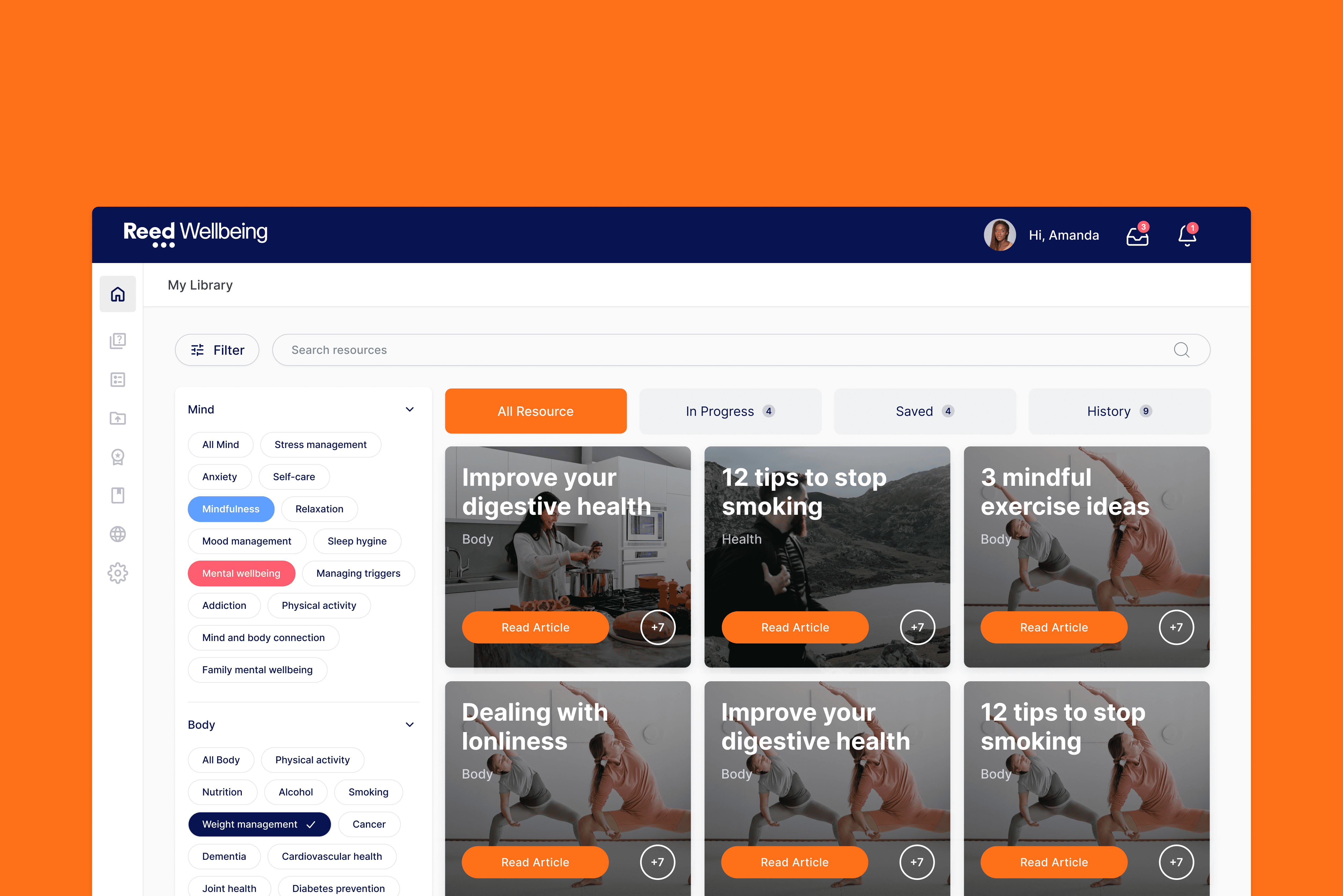
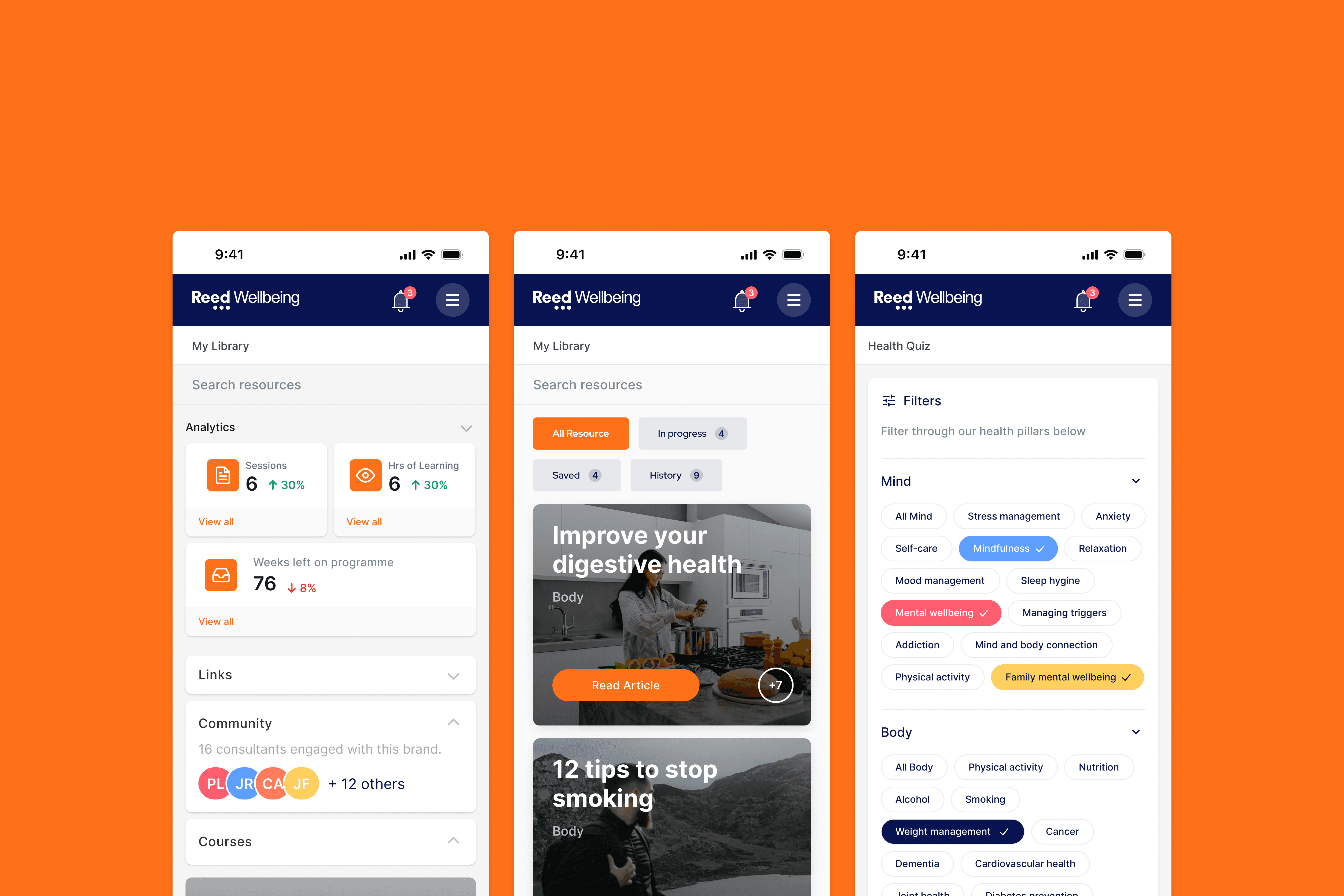
Final Product
The final solution featured the familiar left hand navigation for users to explore. Previously, this was a on signal page that was browsed via card selections.
Design Elements
Font
Heading
Heading 1
Regular
32px
160%
Heading 2
Regular
24px
160%
Heading 3
Medium
20px
160%
Heading 4
Medium
18px
160%
Body
Body 1
Regular
18px
160%
Body 2
Regular
16px
160%
Body 3
Regular
14px
160%
Body 4
Regular
12px
160%
Colour
Brand
Bright Orange
Navy Blue
Light Blue
System
Charcoal
Grey
Background
Critical
Dark Yellow
Light Yellow
Success
Dark Green
Light Green
Warning
Dark Red
Light Red
Main Components
Input Fields
Text Fields
Placeholder text
Text Fields
Placeholder text
Text Fields
Placeholder text
Dropdown Fields
Text Fields
Placeholder text
Text Fields
Placeholder text
Item 1
Item 2
Item 3
Text Fields
Placeholder text
Icon Fields
Text Fields
Placeholder text
Text Fields
Placeholder text
Text Fields
Placeholder text
Buttons
Placeholder text
Placeholder text
Placeholder text
Placeholder text
Placeholder text
Placeholder text
Badge
Green badge
Yellow badge
Red badge