Community event planning flow
Outverse
UX UI Designer
9 weeks
Sade Taiwo, James Frewin
Figma
Branding Exploration, Wireframes, High fidelity
Problem
01
Building this product from scratch meant that we were not immediately faced with problems or challenges but that lack of existing structure did mean that we relied heavily on research and competitive analysis during the early stages of product development.
The brief was to create a platform for content creators to build communities and from research we released the achieving this meant the inclusion and development of
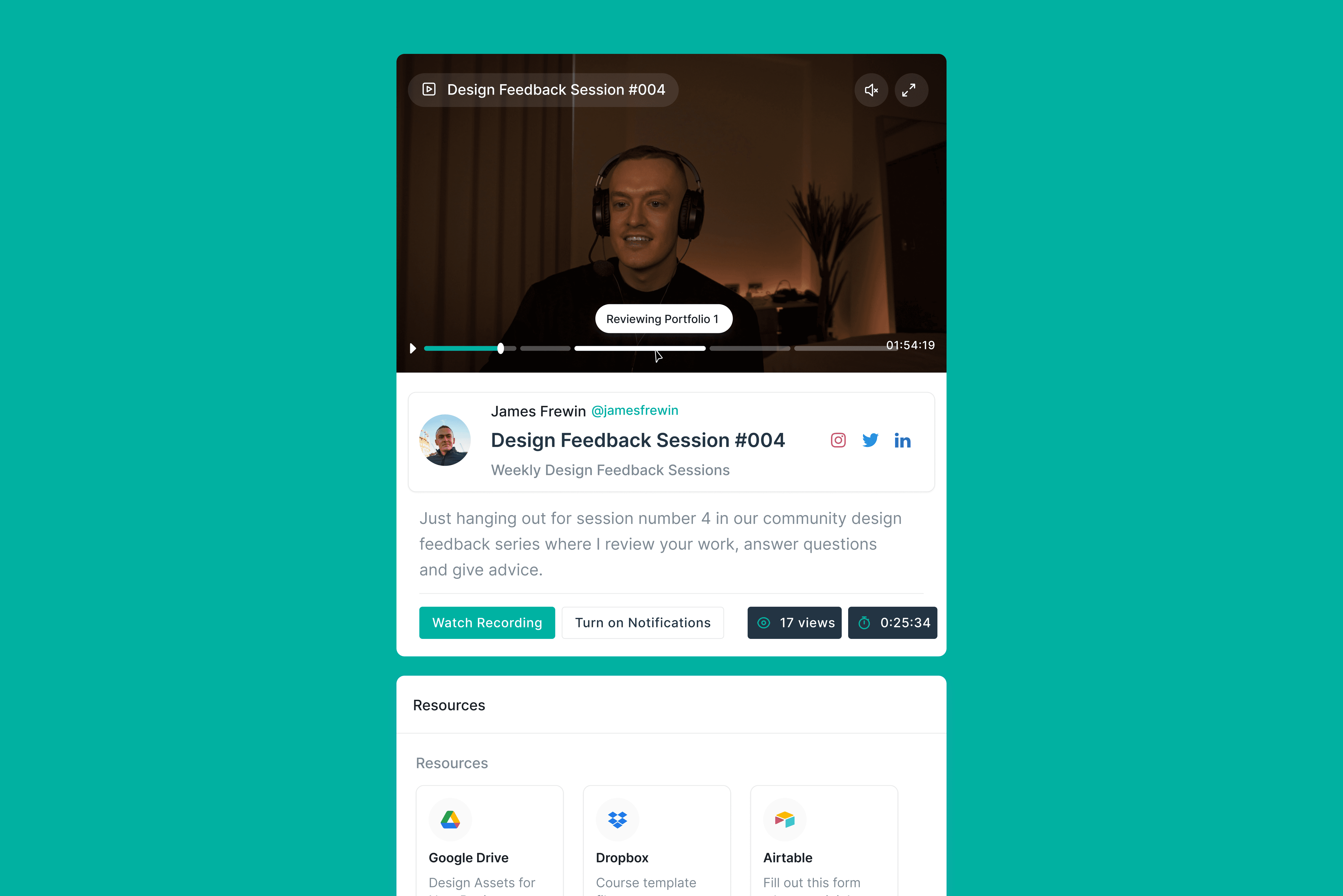
(Live) Video hosting capabilities
Community forums
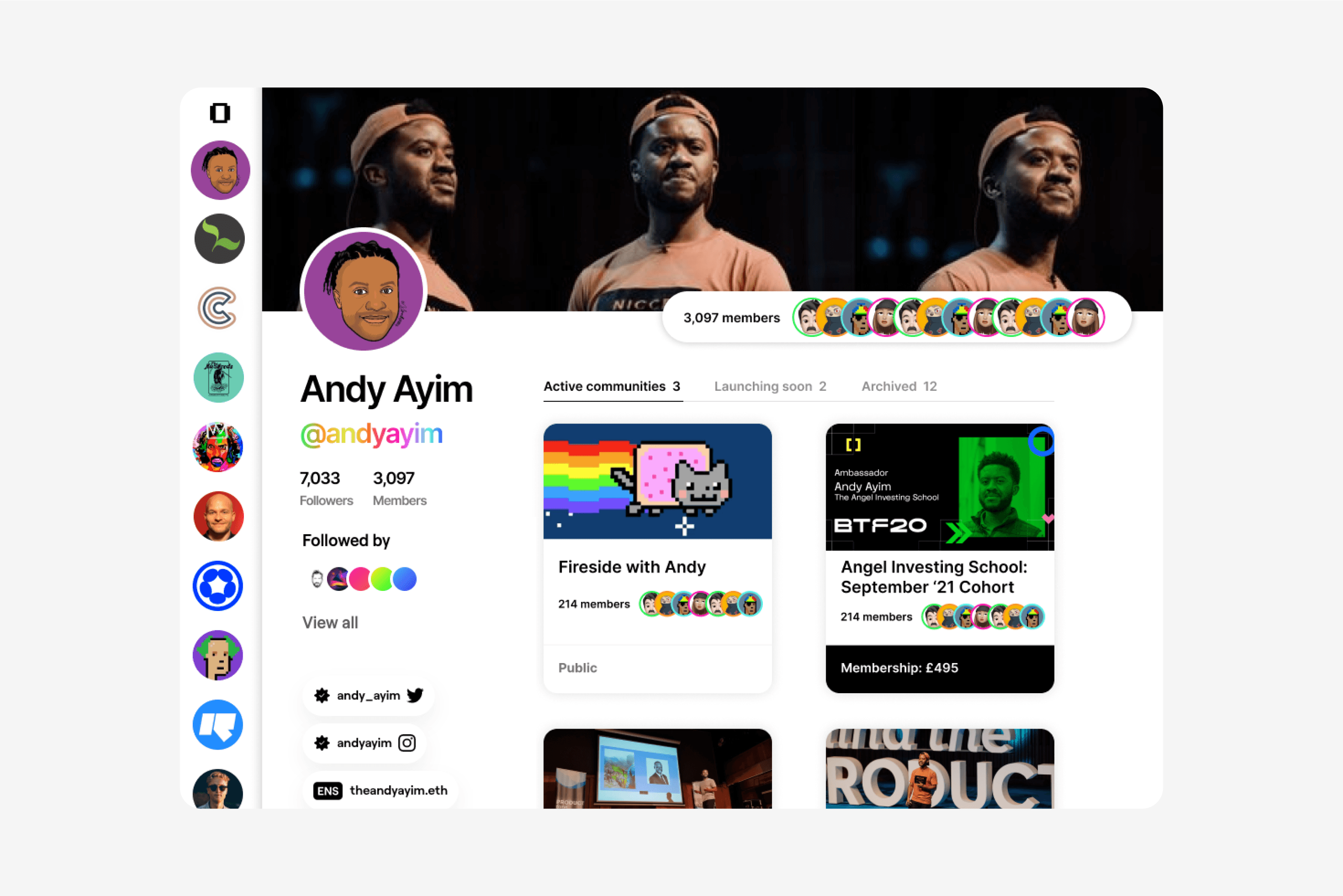
Community profiles
Impact
02
As a result of the platform we built, Outverse
Raised $6M in funding
Were #1 product on Product Hunt for a week
Onboarded 100+ customers in the first launch week
It's also worth noting that based on continuous customer profile research, Outverse shifted their product from community to customer service. The flow of community feedback meant that founders were requesting some more and different from the functionalities.
Research
03
Data Analysis
Something I love to do when building product from zero is use the software 'answer the public', it's a tool that gives you insight into the questions people are asking via Google and to seach by term.
So, we searched the terms 'online community' and relevant associated questions that came up included:
How to create an online community
Why should I build an online community
Online community groups near me
Online community to make friendsPrepositions
One of the top searches was 'how to participate with online communities without interacting', to us, this was a conflicting data point because it's not a positive social behaviour. But what we did take from this is that people should be able to interact with the platform without sharing details publicly such as their name or photo, if that makes them feel comfortable enough to engage.
This idea was influenced by the high engagement rates platforms like Reddit have.
Stakeholder Interviews
As this product wasn’t something that existed, we worked collaboratively with the founders on the research stage. We did in-person and zoom work sessions to ensure we were all on the same page.
What is Outverse?
“Outverse is a live video-centric community management tool: a platform for building, running & organising digital communities in which live video plays the central role in connecting community members over an extended time period. 'Discord for live video' is an appropriate analogy (to the extent it conveys the plug-and-play nature, bottom-up approach, and community-centric focus of such a product!).”
Describe Outverse in 3 words
Immersive: When users are within Outverse, they should feel like they're within a platform/web app rather than just on a website.
Organised: We want to make it super easy for community members to know what sessions are coming up – and where to find previously recorded sessions, etc.
Collaborative: We want the platform to feel intimate and engaging from a community standpoint.
Product sketches
At the end of our stakeholder interview, the founders shared their own wireframes of how they were envisioning the product. This is unusual when working with founders but so useful when it comes to the design process.
Due to buget and time, the founders wanted to skip the wireframing stage, this wasn't ideal but the process was eased with these product sketches.
Comp Research
We researched into other community platforms like Twitter, Circle and Geneva to get a better idea of the interfaces that customers were already used to in this space.
Familiar navigations
All brands used Jackob’s Law to develop their products. The one thing they had in common was the vertical left-hand navigation bar. So we decided that this would be an important feature for Outverse.
Over-reliant on aesthetics
Geneva wasn’t necessarily the easiest to use functionality wise.
As a new user, some features were hard to find
It wasn't possible to 'search' through their event library, instead you had to scroll which felt like a bit of a blocker
They had obviously taken advantage of the Aesthetic Usability Effect but for us, this meant we paid extra attention to the smaller interactions.
It was also a point I brought up when speaking to the founders because initially, there were multiple features briefed, bu this allowed up to argue an alternative way of working where we ship features in a staggered format so we could get feedback and iterate.
Missing features from Outverse scope
As a whole we realised there were 3 features that had not been considered for Outverse:
Private messaging
Forums
Subscription / pricing model
It was decided due to budget and time, the 'private messaging' and 'forum' features would be a v2 focus. Upon launch, the platform would be free for both creators and community members but then Outverse wanted to later roll a pricing plan that would take a % of the creators earnings.
Design Process
04
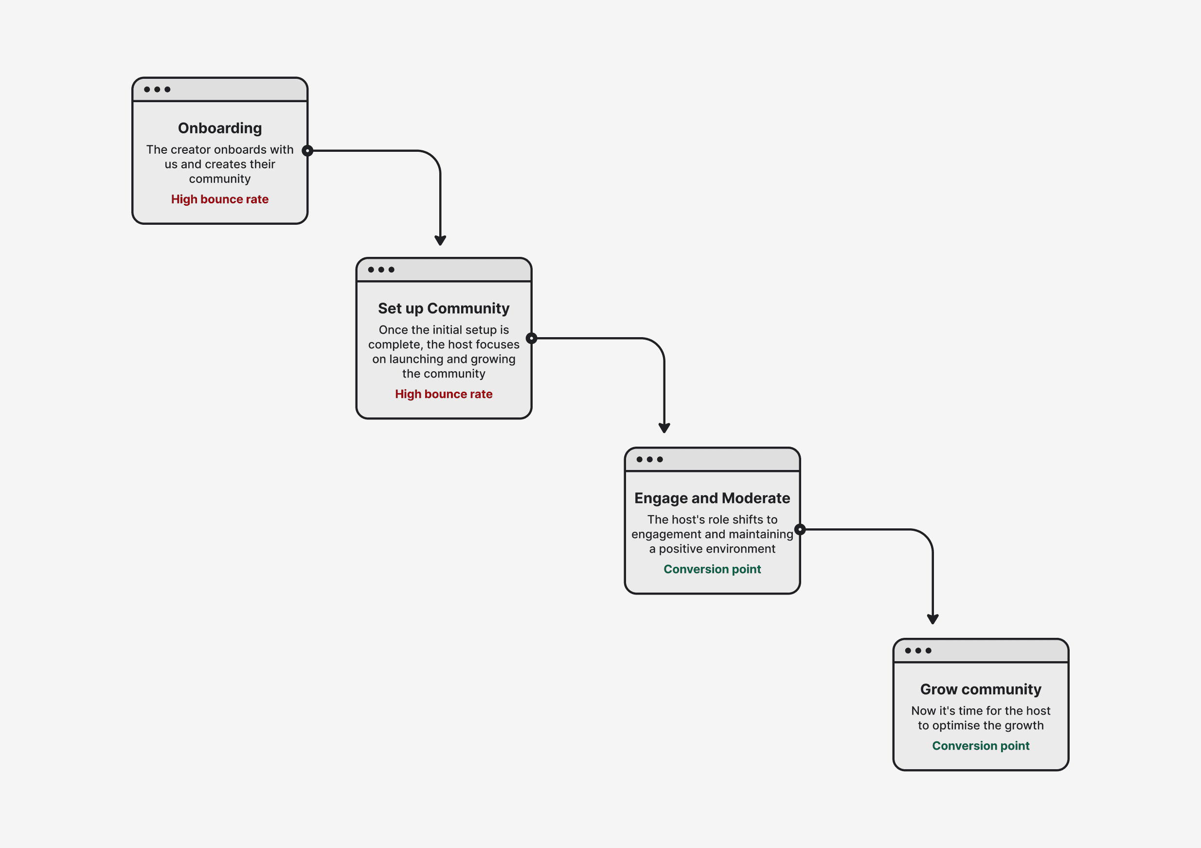
User flow
This piece of the project could have done with a little more extensive research but due to budget and time, we were only able to action a small user journey exercise. It was enough to build the MVP but we suggested some user focus groups post-launch that would allow for a more extensive look at the user flow.
From this quick user flow we were able to prioritise the features needed to launch. We decided on:
Onboarding
Community launch
Engagement and Moderation
Moodboard
As we were designing the product from inception we carried out a moodpboard exercise on a shared Figma file where the founders could interaction, share and comment of any of the Inso assets we were curating.
Branding
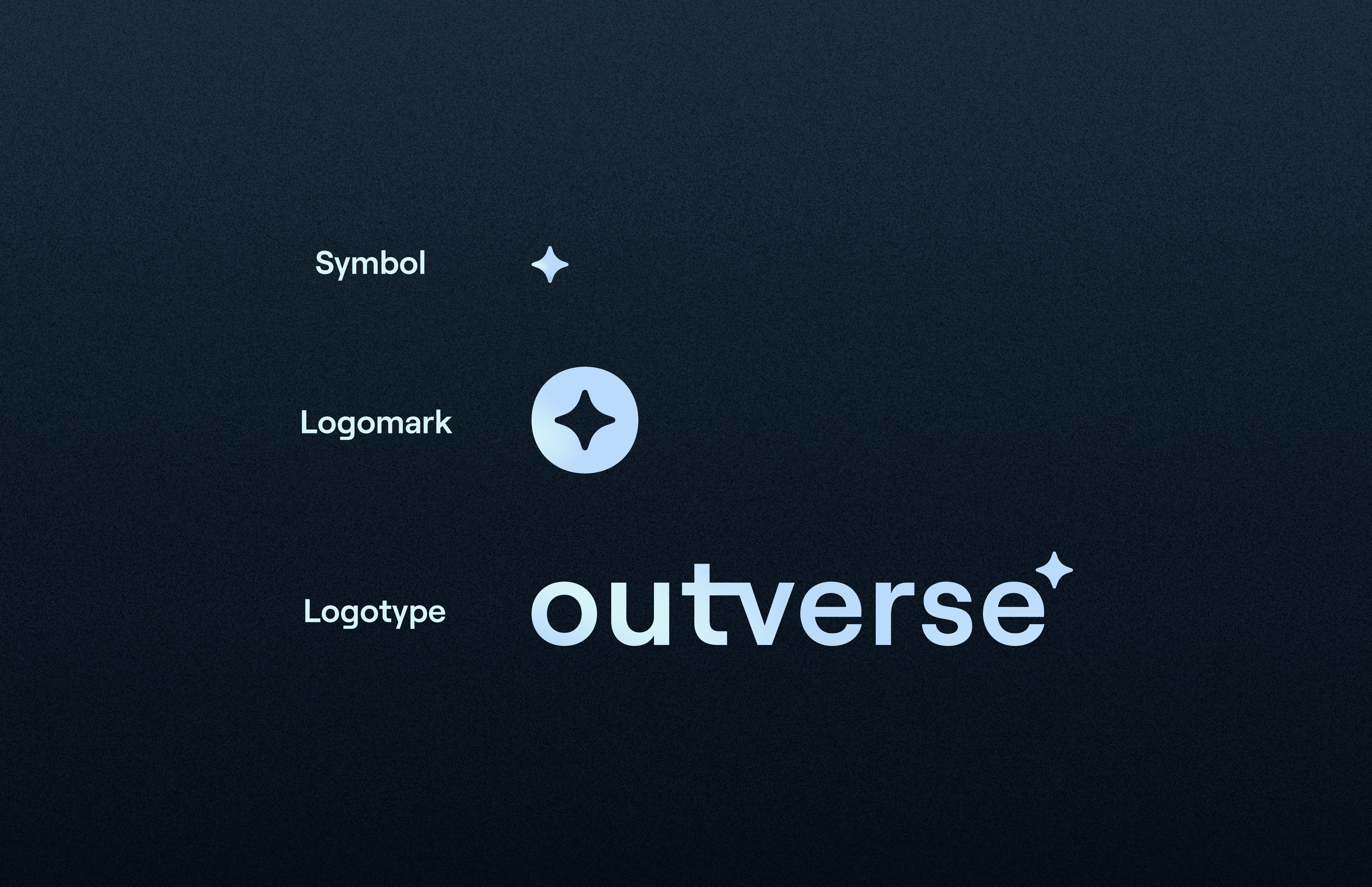
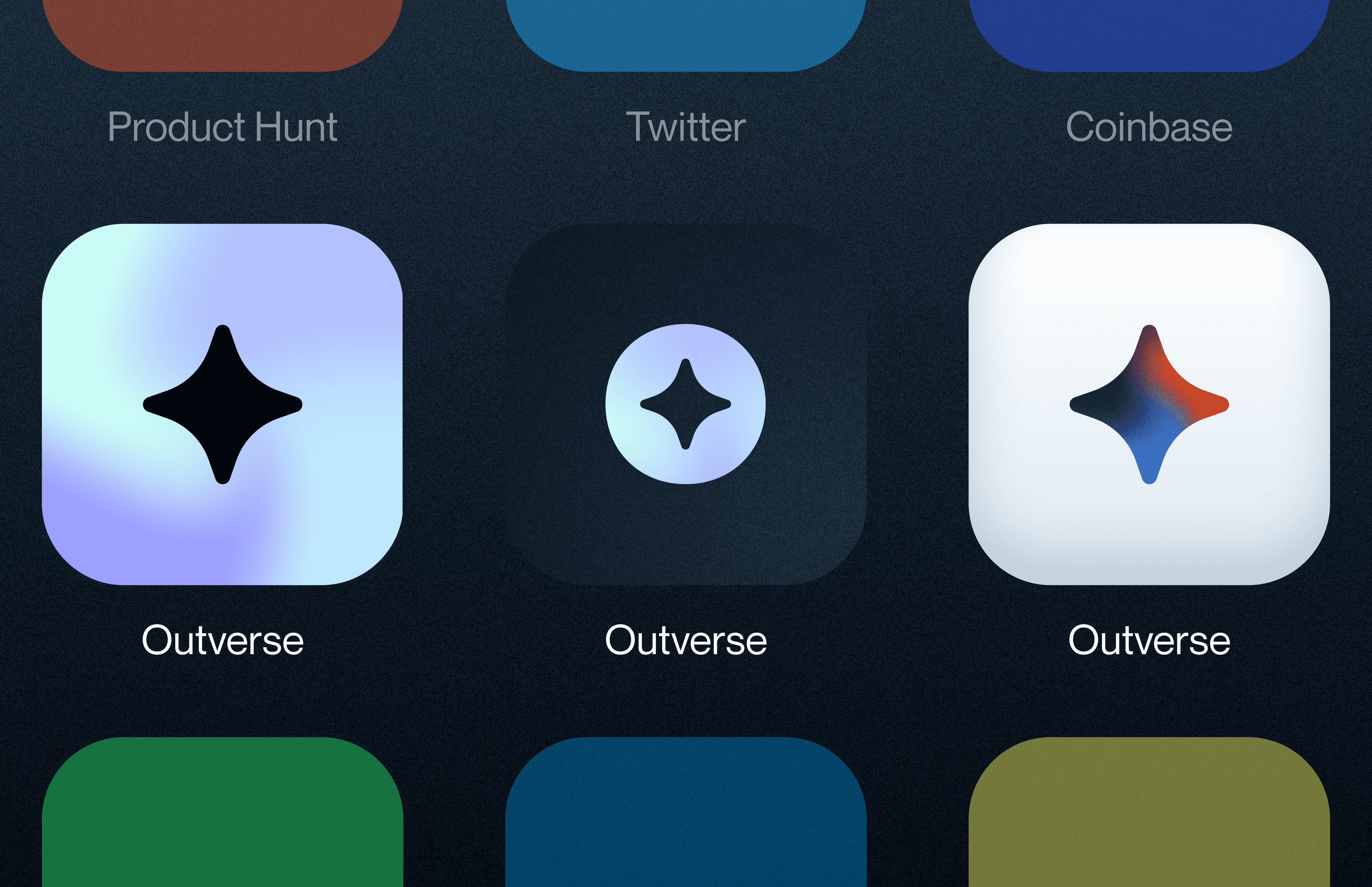
The founders gave us the goal of leaning into a brand that was inspired by space and astrology.
Simple Icon: The star icon was a shape born out of the letter ‘e’ motif
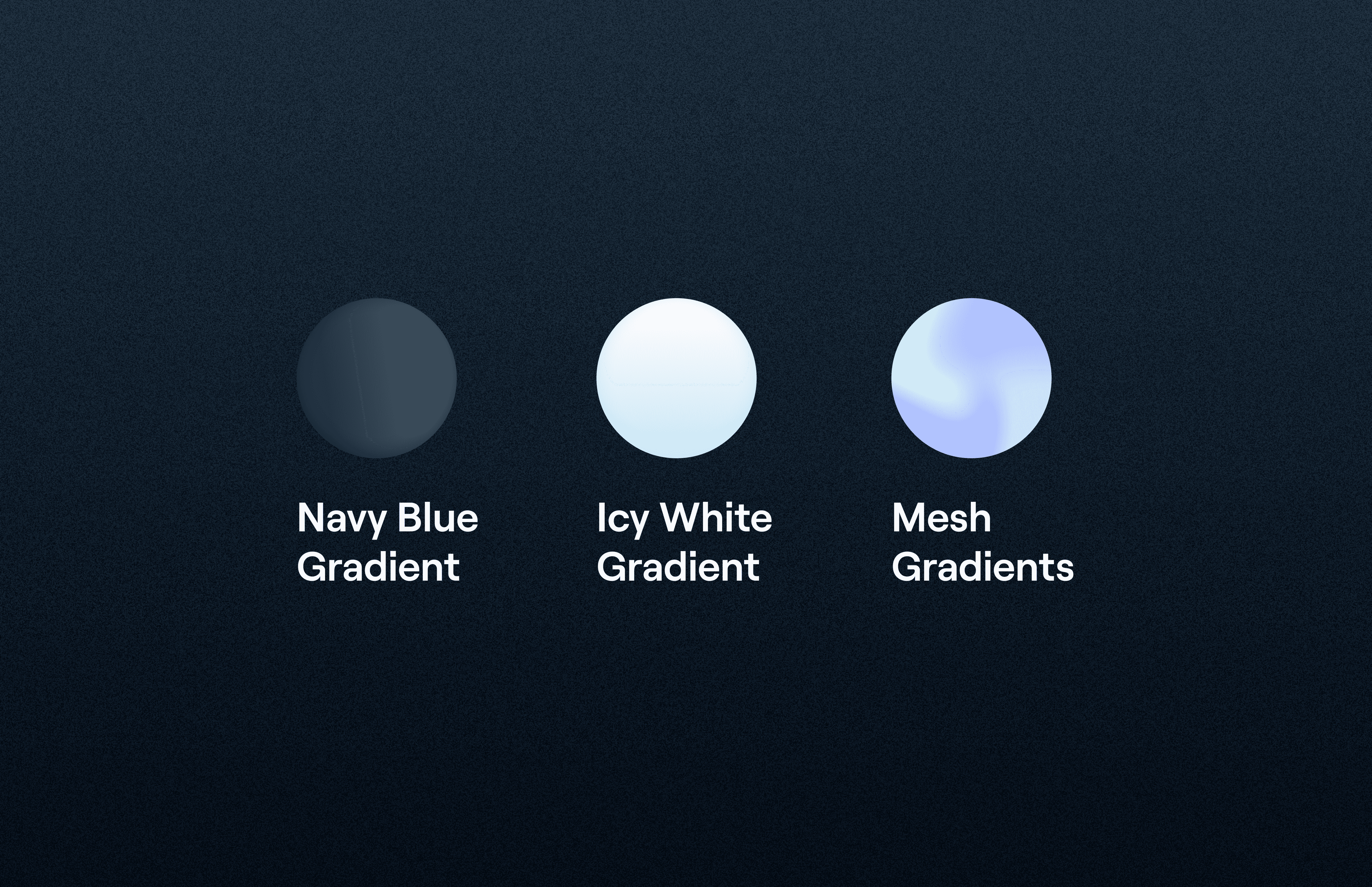
Gradients: This shows the galaxy-esc elements of the design. I think this is quite literal, though and I would perhaps look into something a little more subtle if I was to do it again.
Subtle Grain Effect: I added a subtle grain effect to add to the “space” effect of the design. I think adding texture to colours can add a level of depth. Especially since there are a lot of dark colours being used.
Typography: We went with something easy to read and modern.
Final
05
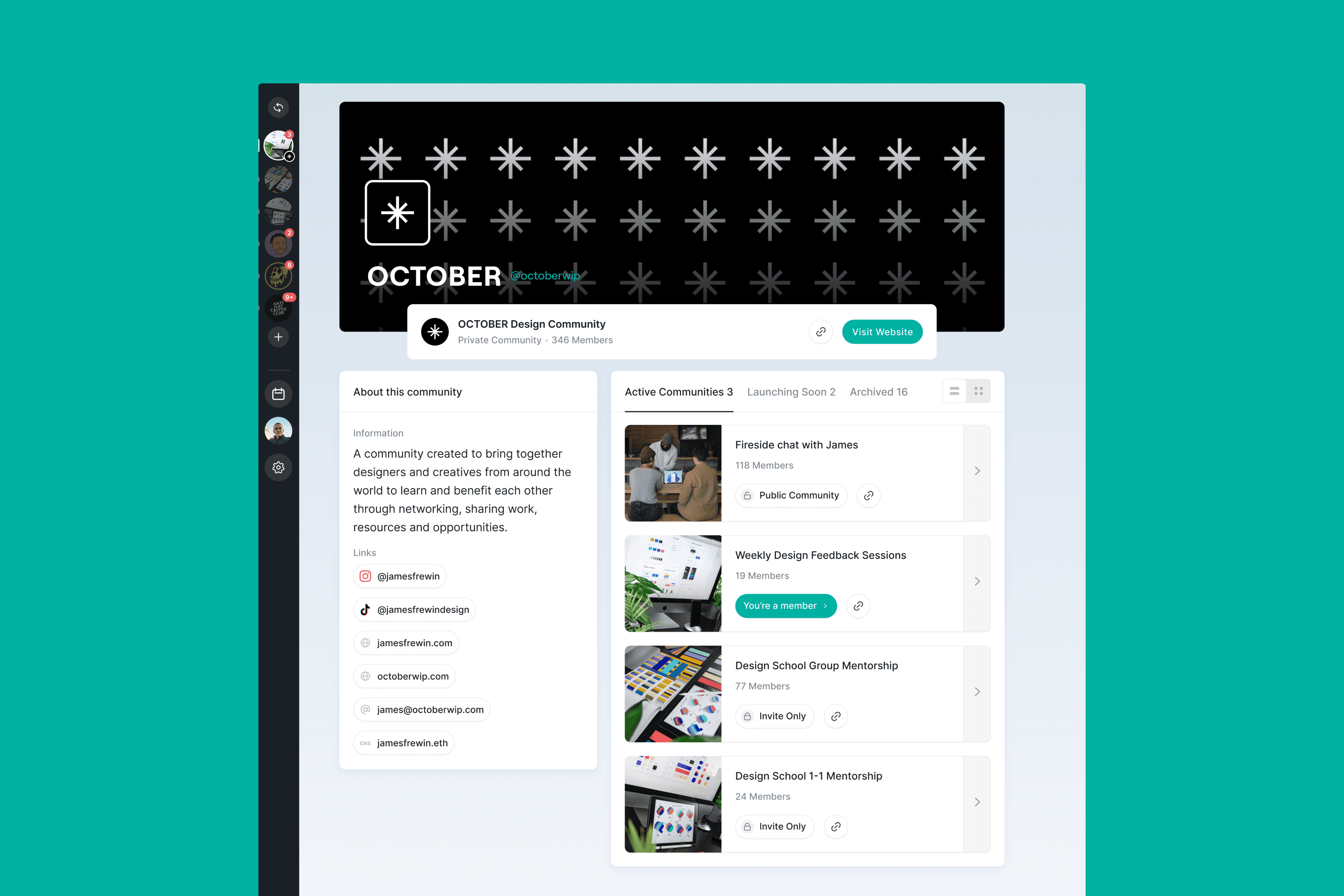
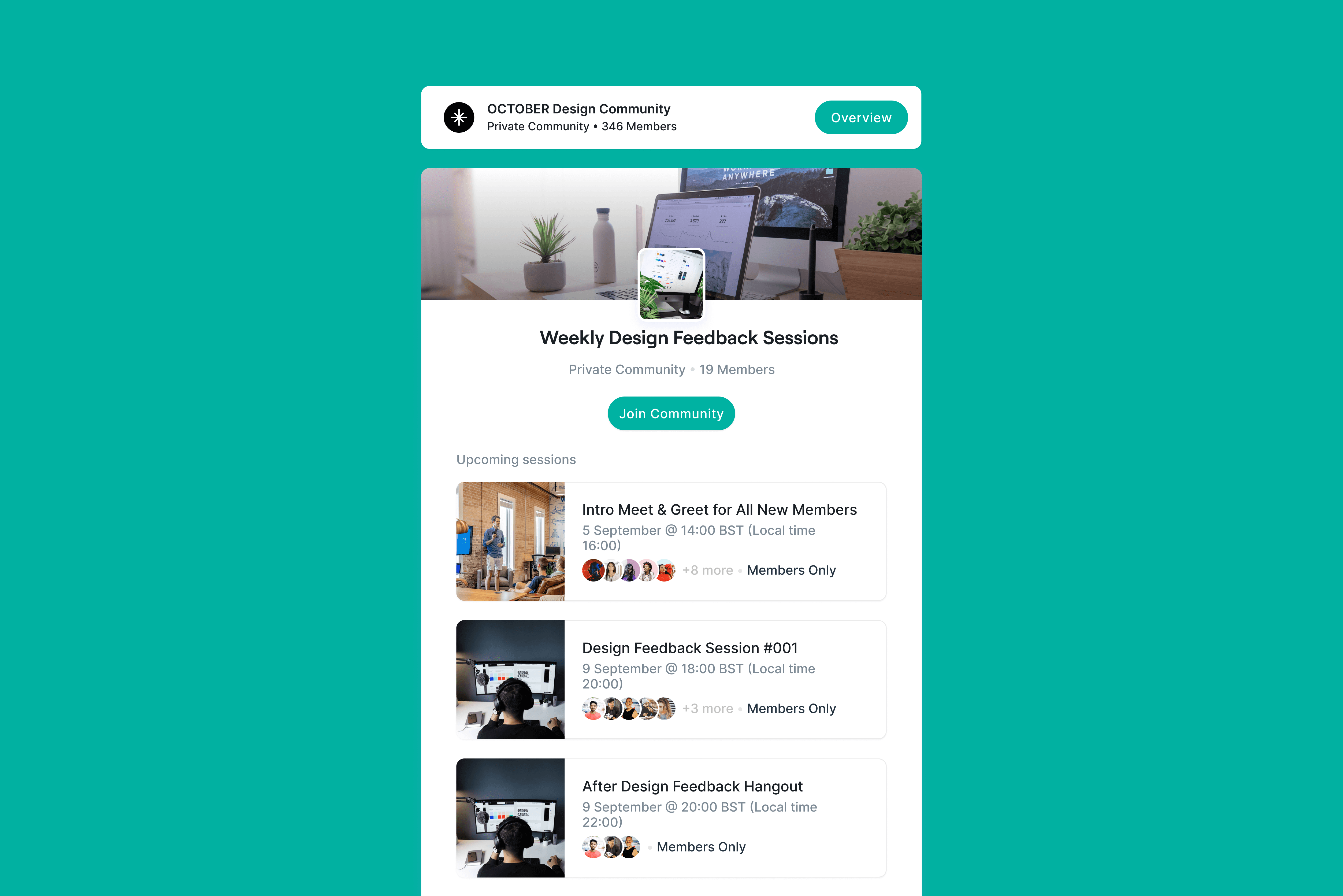
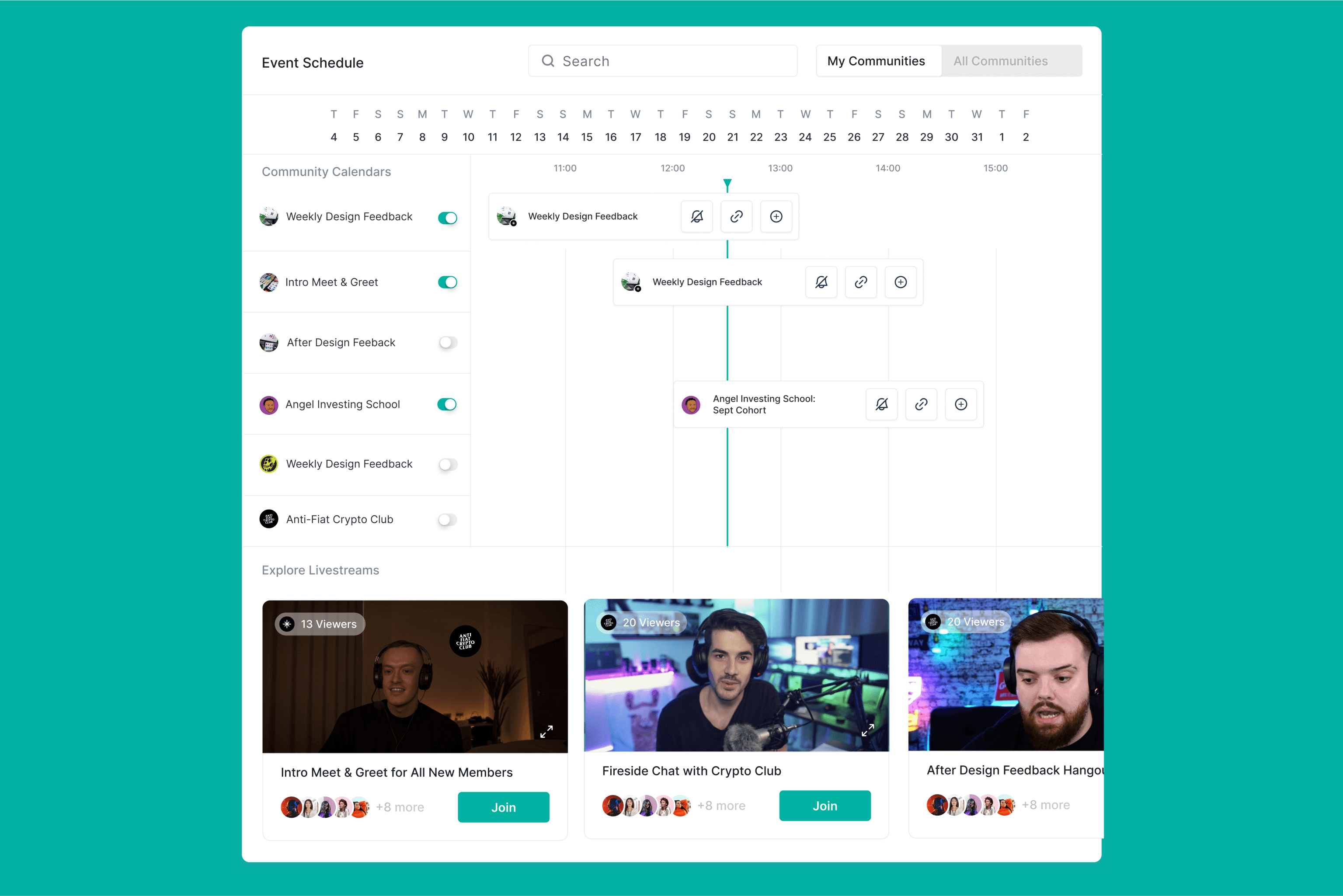
The final solution for Outverse was an intricate platform design that included:
Log in / log out access
Left hand navigation
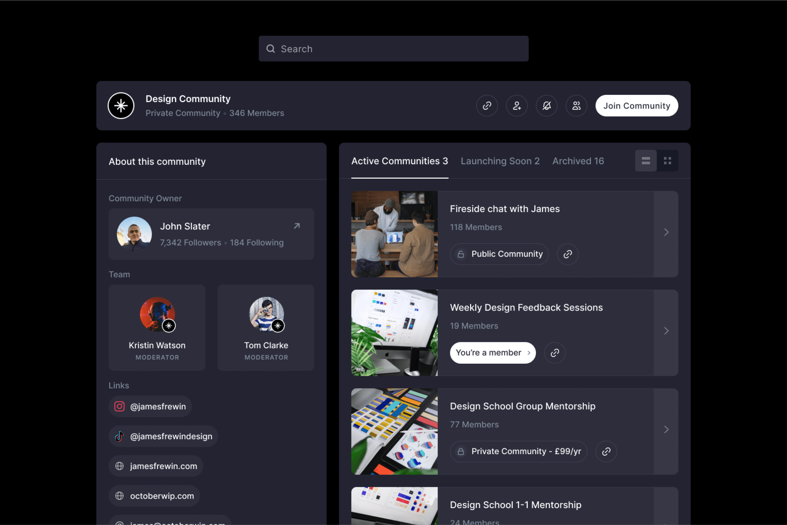
Community profiles
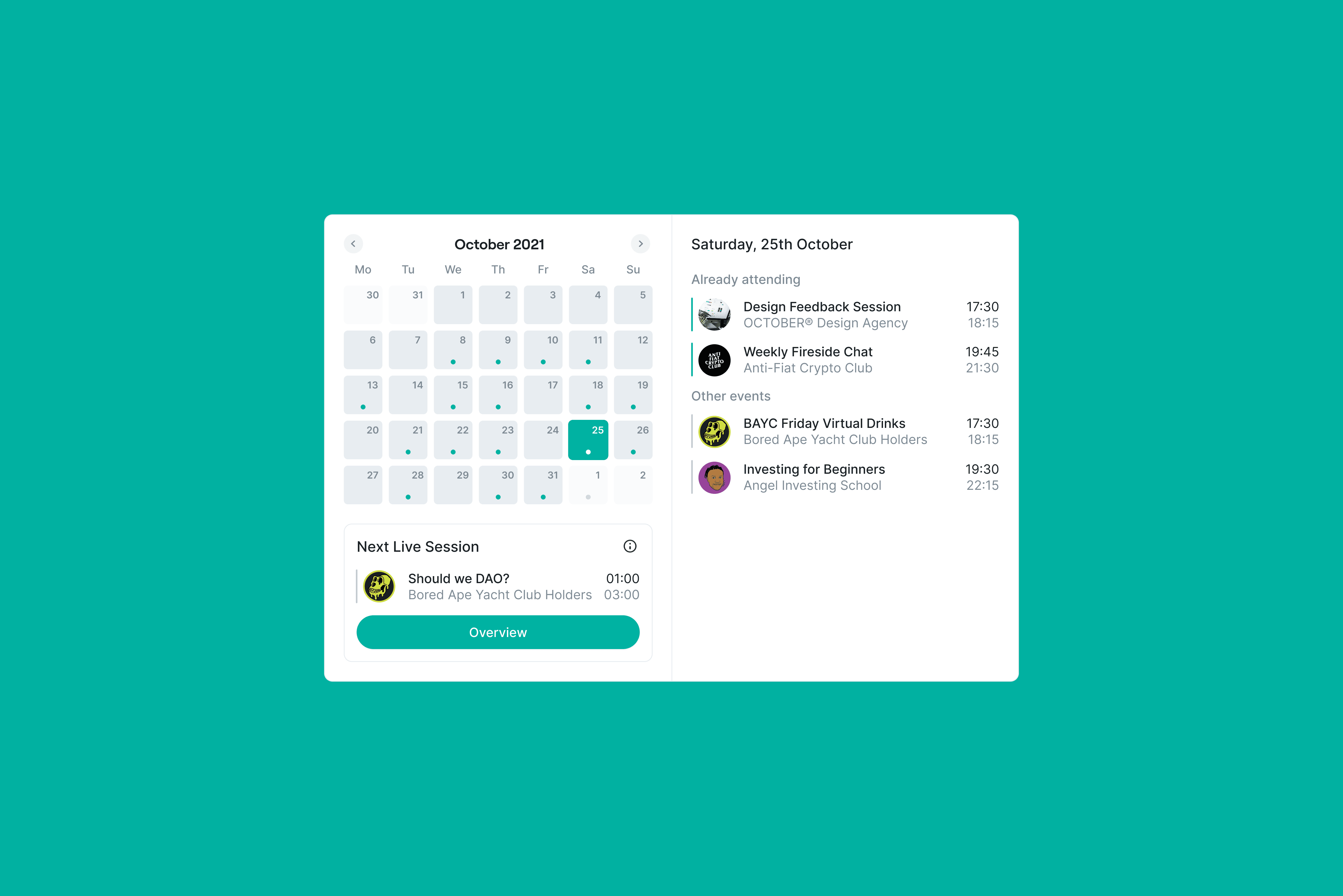
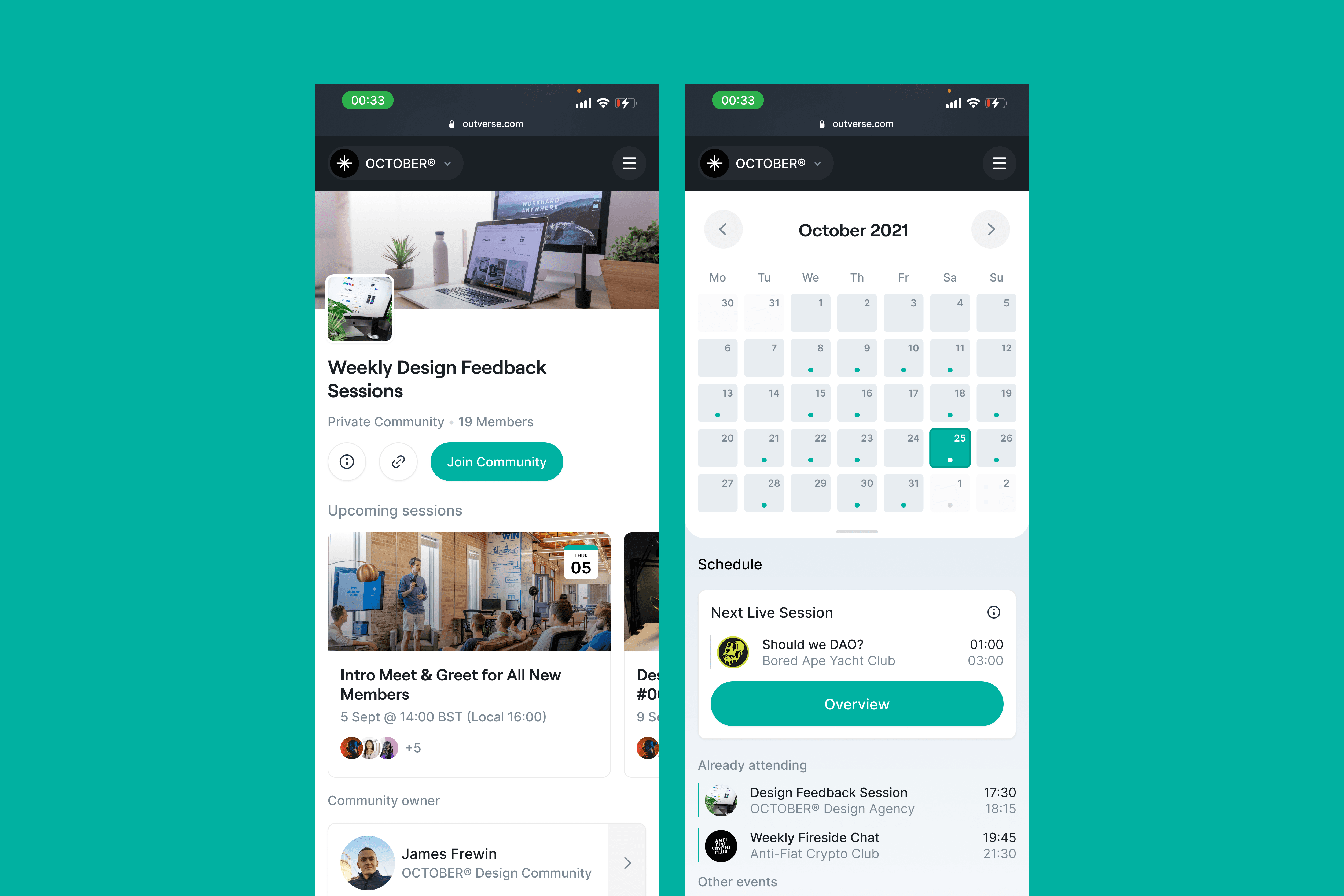
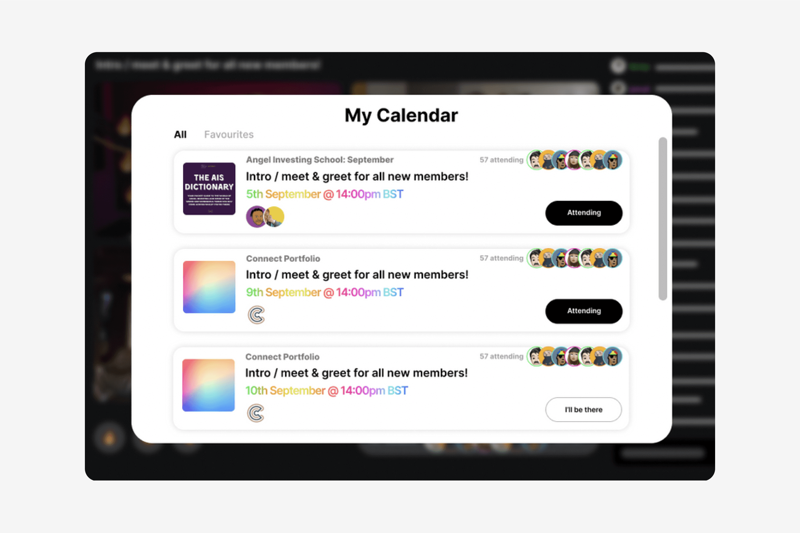
Events calender
