Dashboard redesign for copyright management tool
Trips
UX UI Designer
9 weeks
Sade Taiwo, Karsen Daily, Michael Finklestein
Figma
Wireframing, Prototyping, High Fidelity
Problem
01
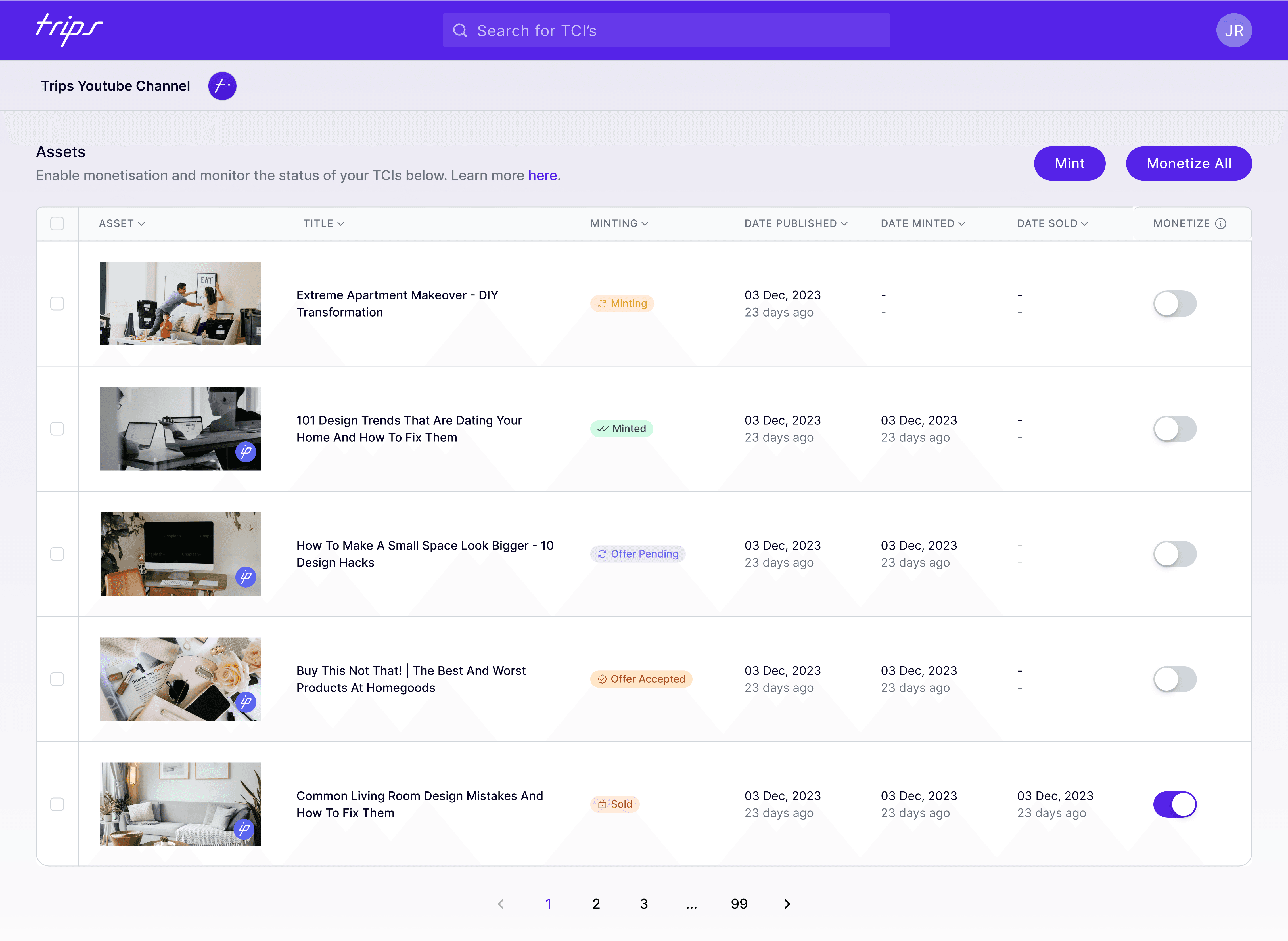
As Trips planned their product expansion, they wanted to further develop their dashboard and they wanted the updates to be lead by user feedback.
Impact
02
The features are still in development so there has not been mass testing. However, this has been demo'd to investors and has initiated investment.
The prototype can be accessed here.
Research
03
User Testing
The platform currently has just under 100 content creators using it so I reached out and got ~15 users to provide us with in-depth feedback about their experiences using the platform.
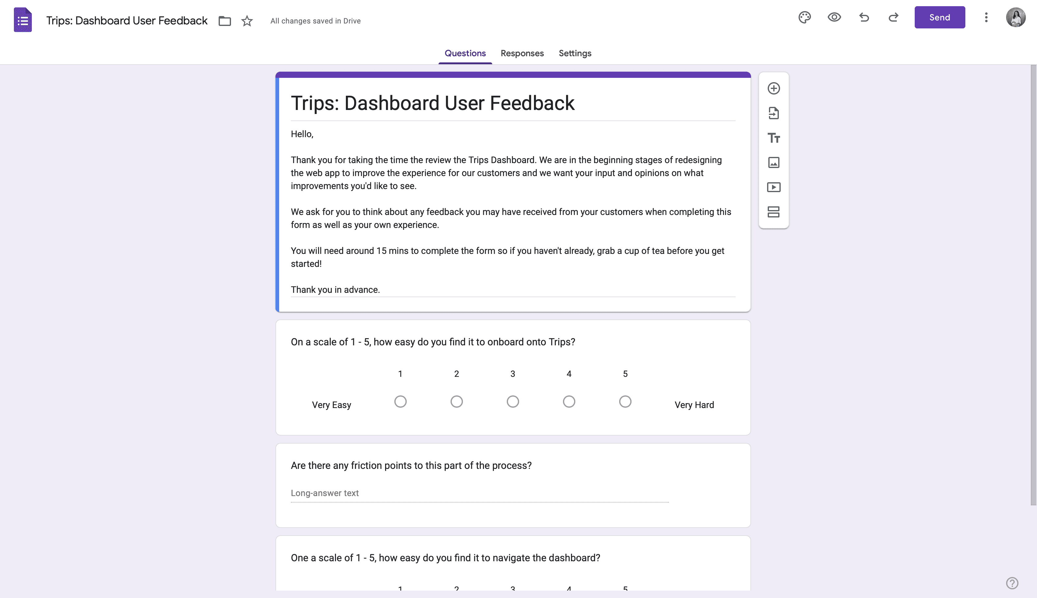
Initial user testing feedback gave us a couple of those to develop including:
Navigation doesn't feel intuitive: Initial user testing sessions shone a light on the products complex nature. As this is a new product and process for most users, they wanted it to feel more intuitive and familiar.
Language: As with any MVP product, it had been developed by people who were very close the product and very knowledgable in the industry; meaning the language used was not familiar to the regular content creator.
Feature optionality: Users wanted all the 'need-to'know' features available from the dashboard. With guidance on how to use them. They found that features hidden within 'settings' or other pages were easy to forget about.
I worked with the brand and product teams to clarify the solutions and prioritise accordingly, thais started with going back to the user flow and ensuring these features were prompted in the correct area of the users journey.
Design Process
04
Scope
To create a more interactive dashboard that took onboard user feedback. But an important part of this is that the founder wanted to maintain a streamlined onboarding flow.
Site Map
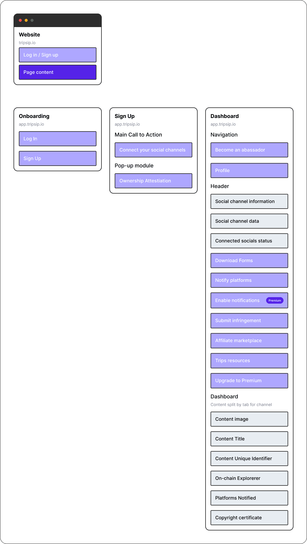
The first step we wanted to take was to relook at the site map to visualise where the best places to highlight the premium package.
Mid-fidelity
Common feedback that we received on the previous iteration is that users wanted the platform to feel 'easier to navigate', they want their experience to feel intuitive and seamless, so it was important for us to reduce the users choices with Hicks Law so they could make quicker decisions that didn't use up too much brain power.
Onboarding
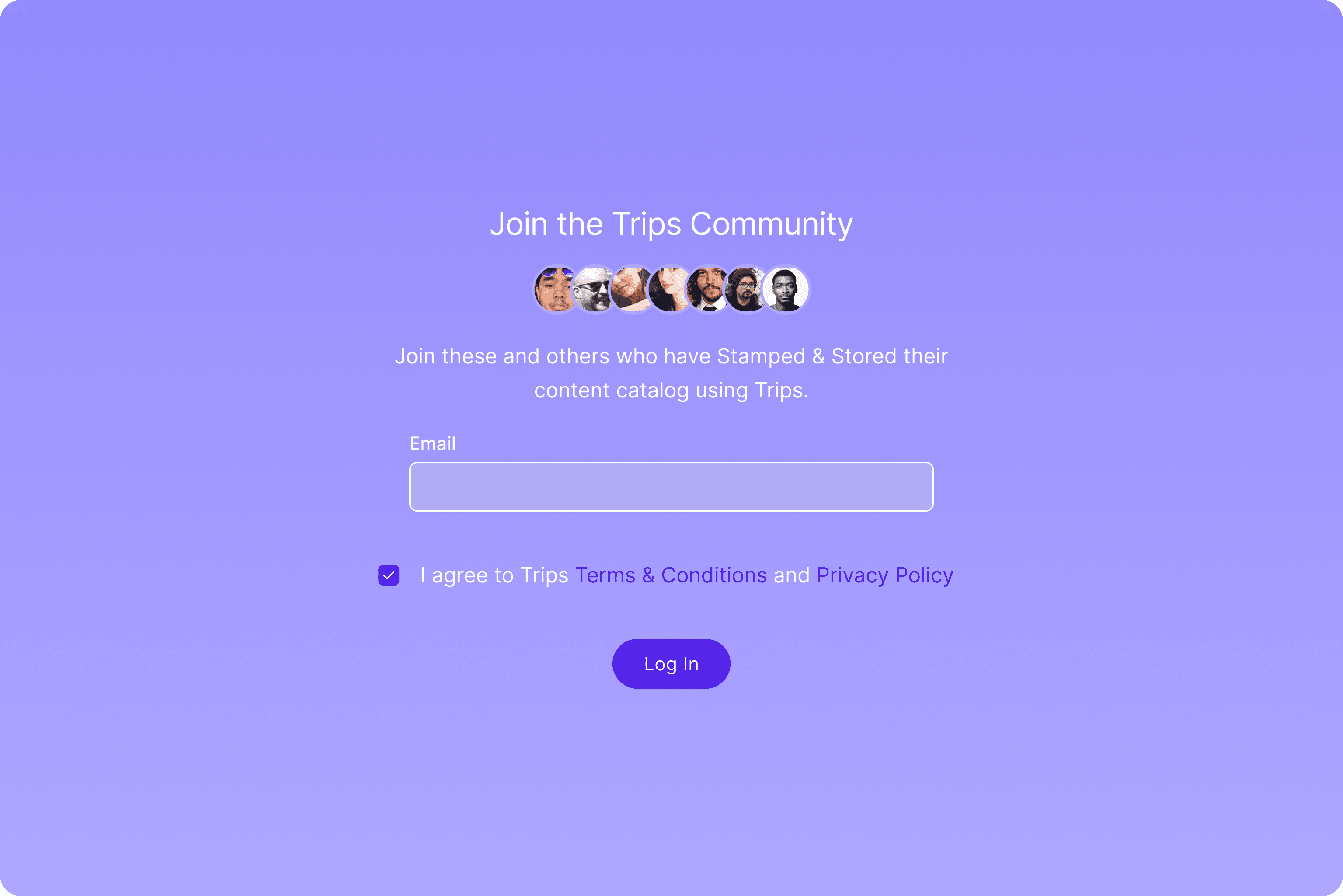
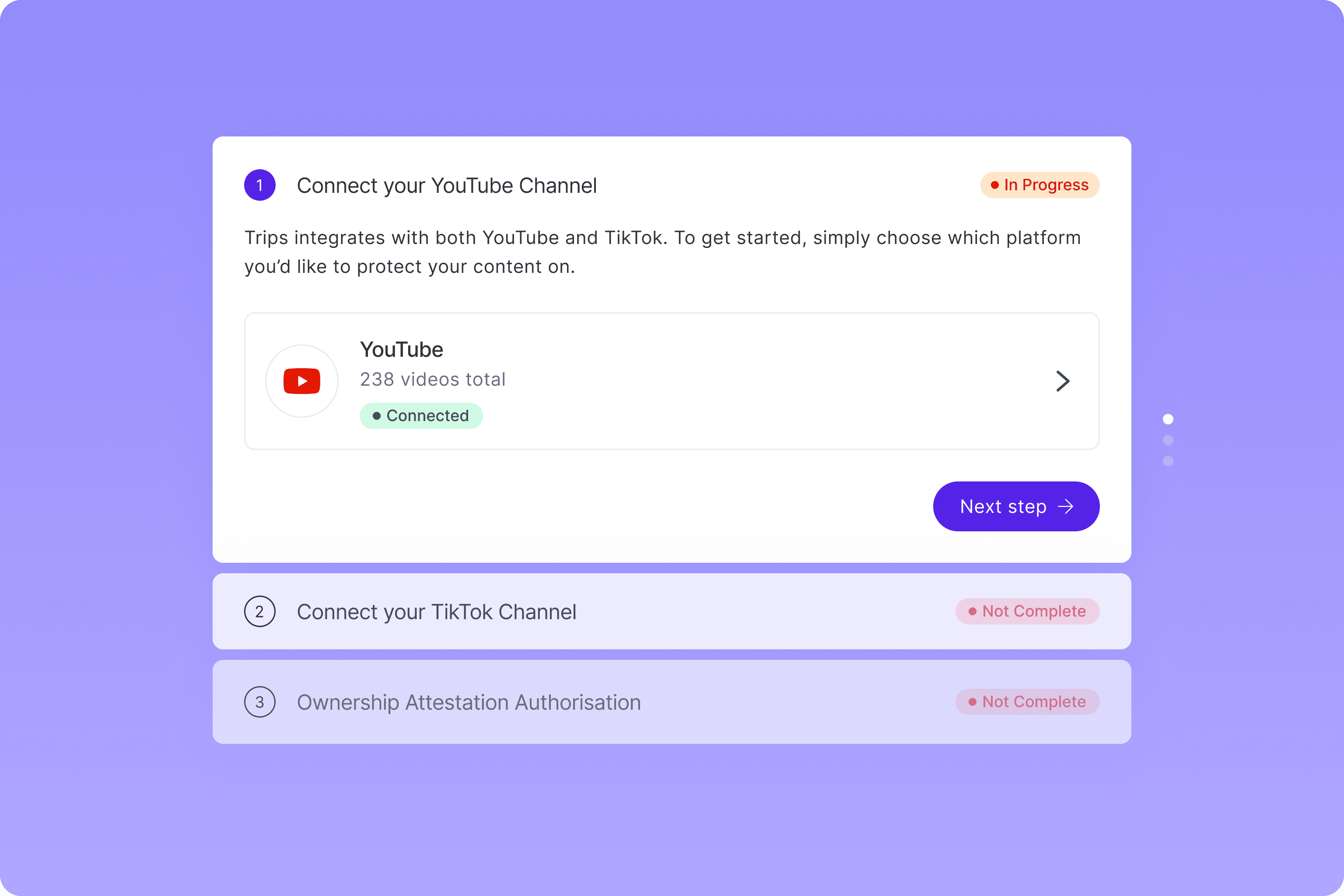
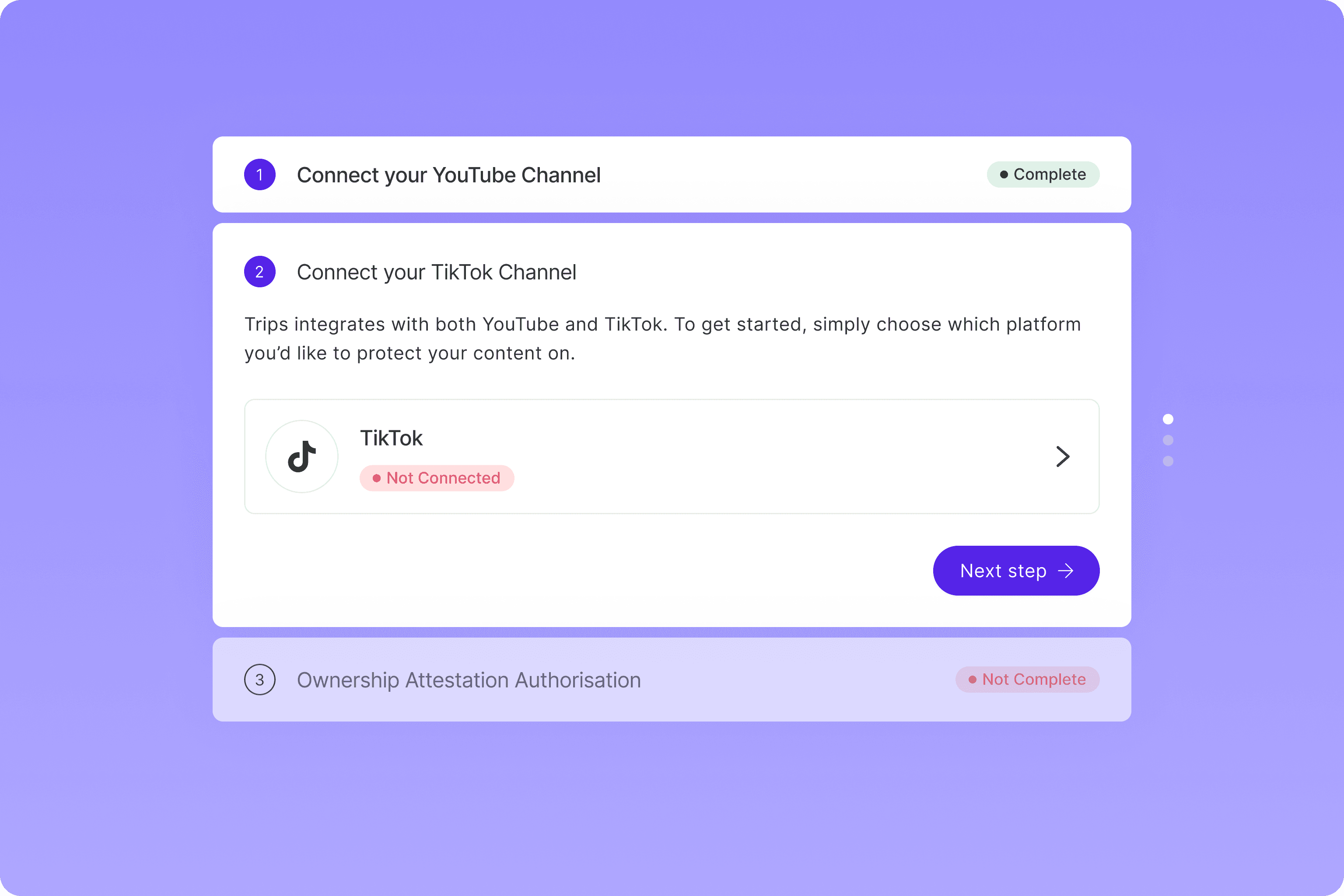
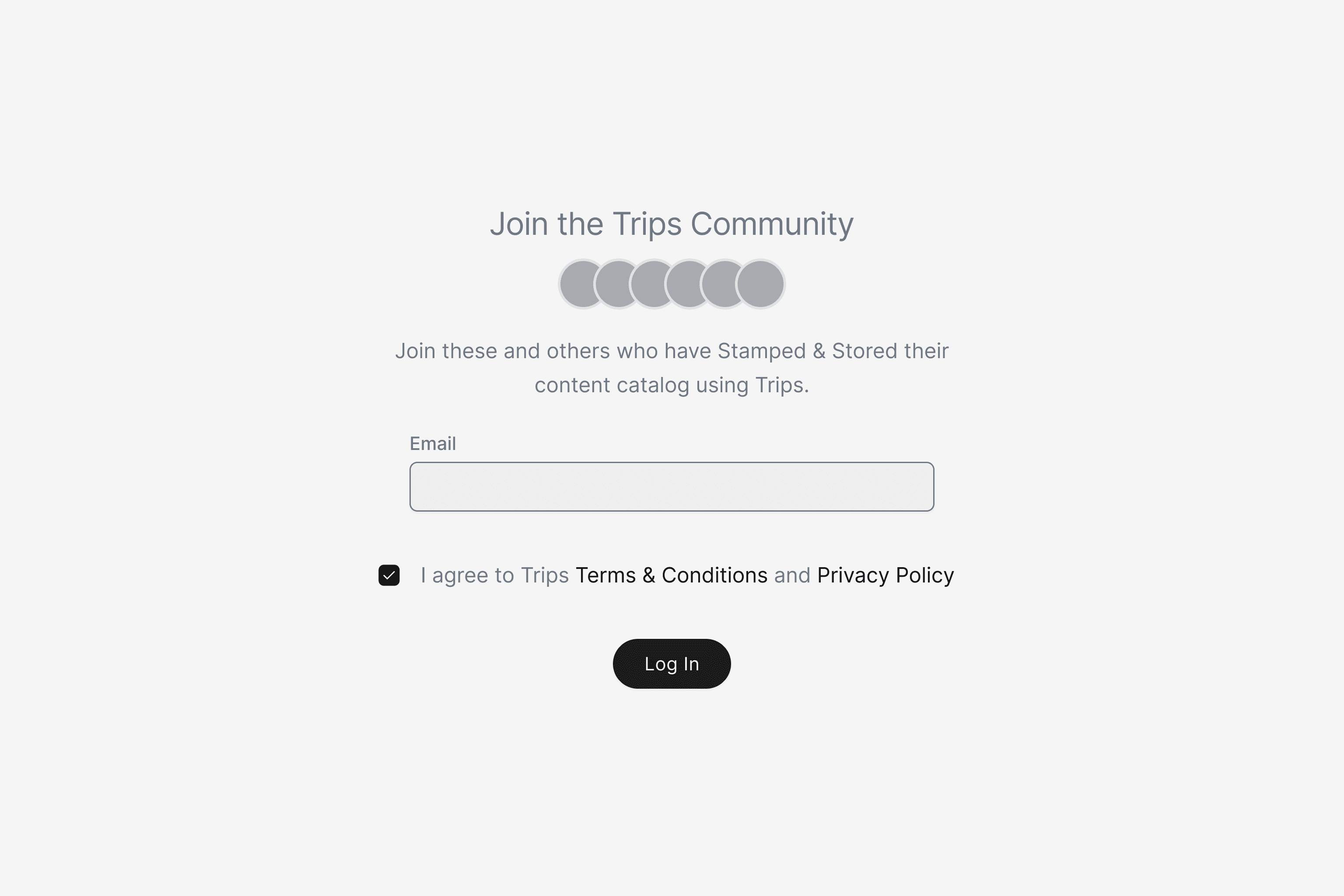
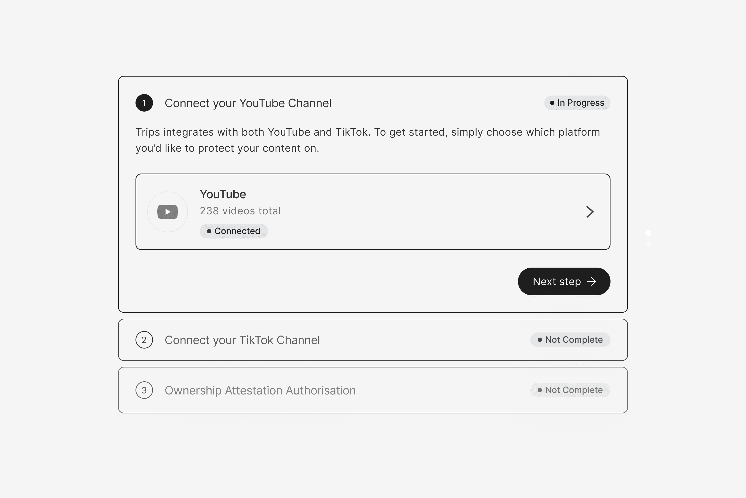
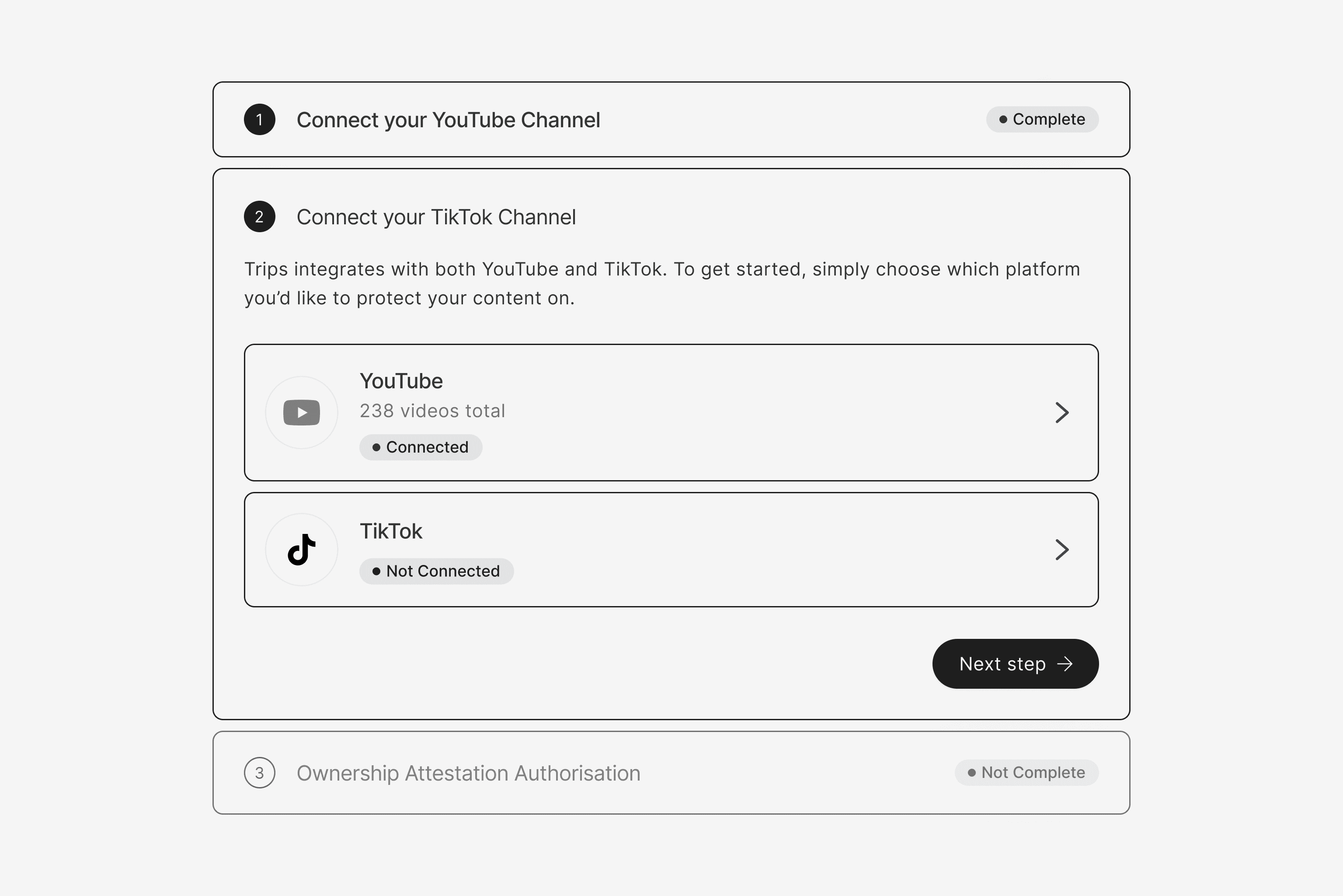
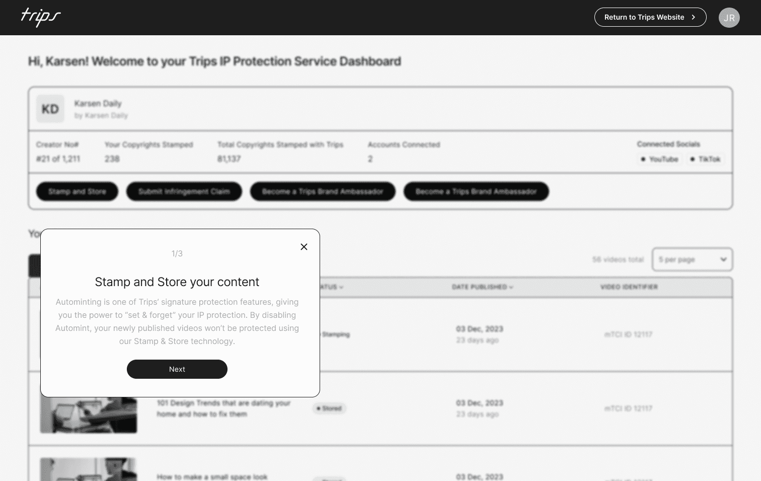
We realised that the platform really started from the onboarding and to elevate the intuitivemness of the user journey, we had to start from there. Trips required 3 levels of authorisation from their customers before entering the main platform. This is a high friction point for a SAAS product as the users is giving more than they are receiving. In order reduce the bounce rate within the user journey we applied the goal-gradient effect which uses opacity to reduce the cognitive load of the user.
The Dashboard (V1)
It was decided that alongside the planned updates, we needed to showcase a few more data points to the user. The idea was that this would keep them engaged in the product and their content. The finalised data points included:
Number of verified videos
Number of non-verified videos
Number of platforms aware of verified videos
Number of emails sent to platforms
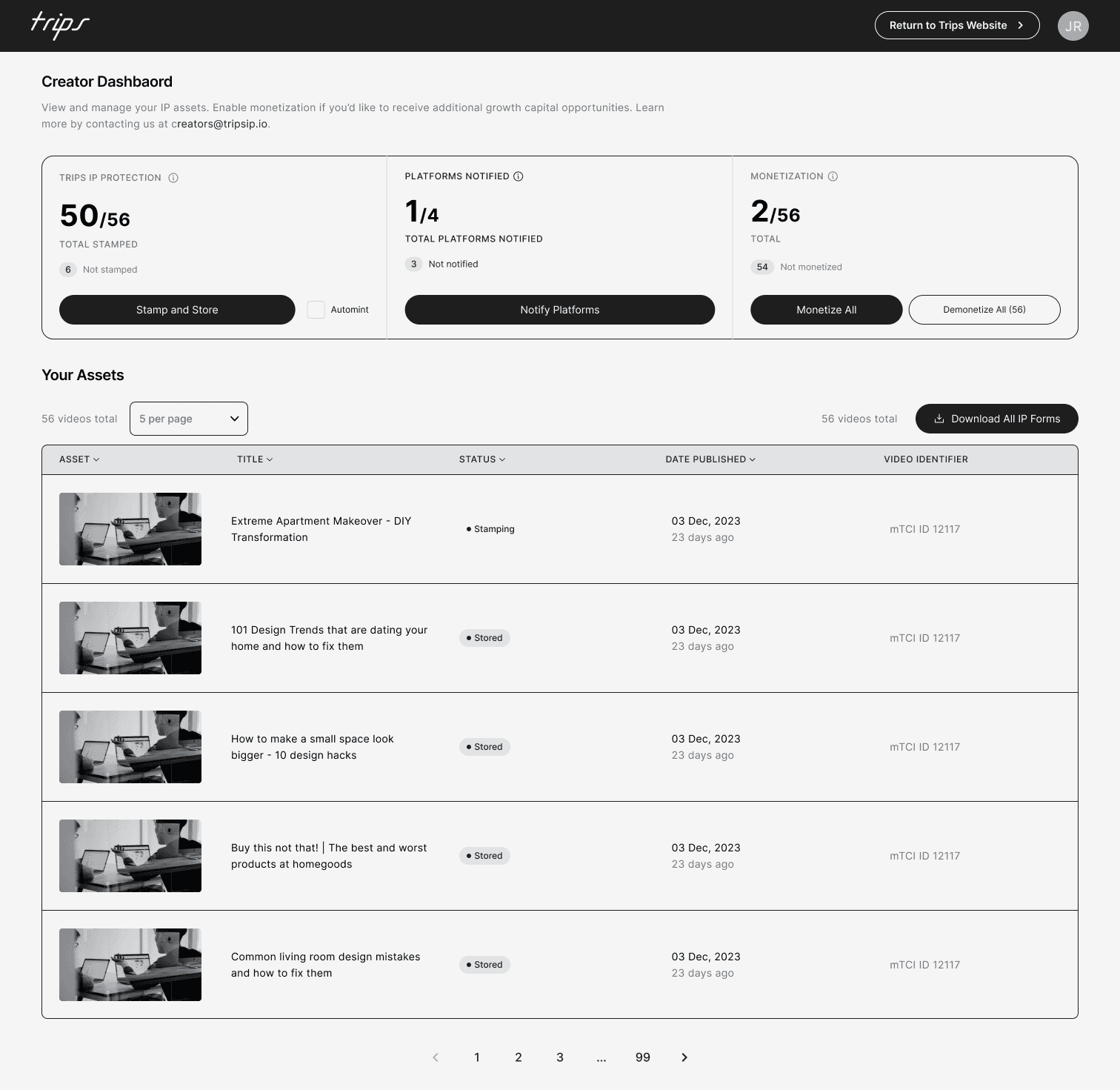
However, we shared this version of the screen with 12 of our most engaged creators and discovered that they didn't find that information useful.
Feedback
8 out of 12 of the users wanted more guidance/hand-holding on the dashboard
11 out of 12 of the users felt like the data didn't add to their experience or encourage them to engage
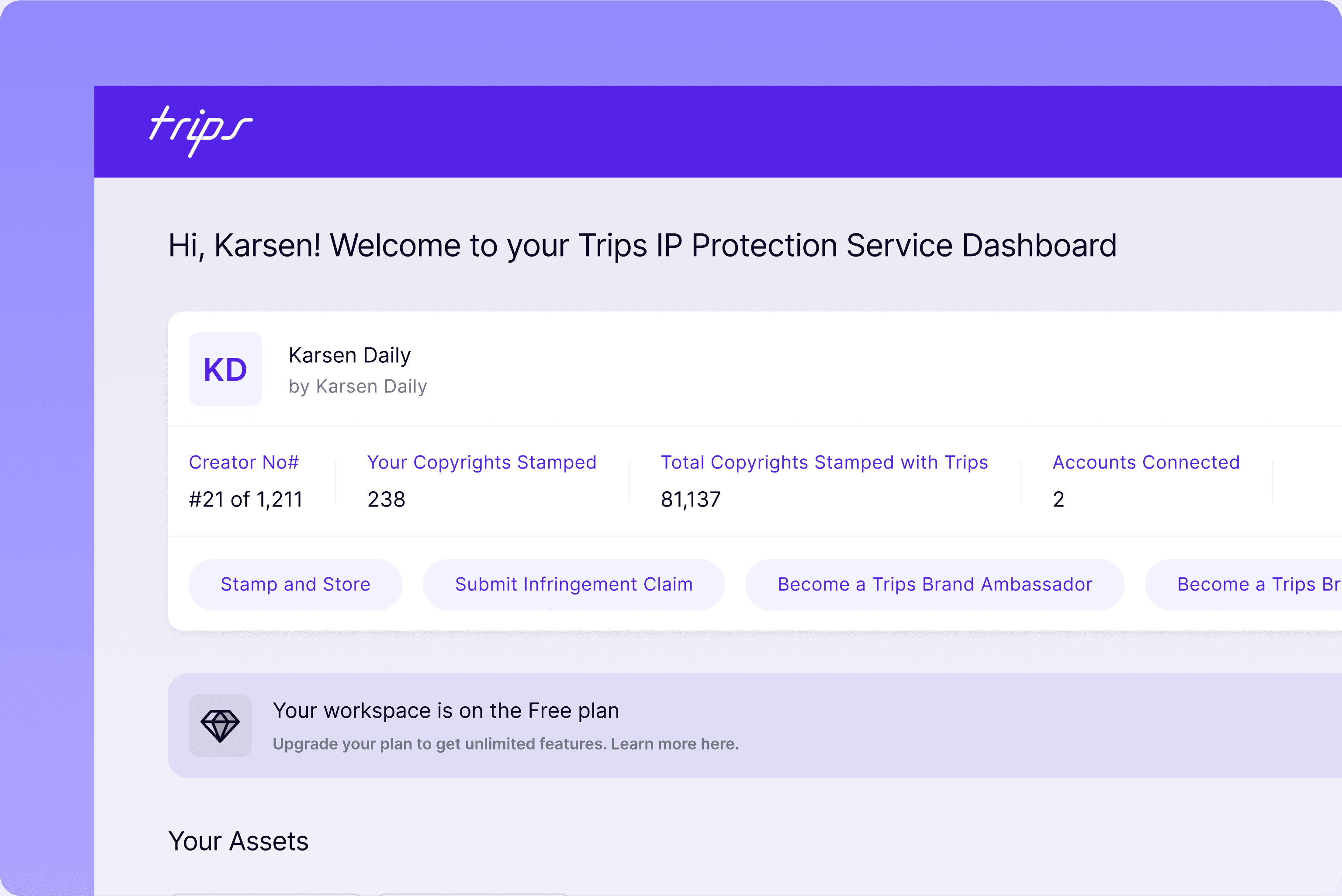
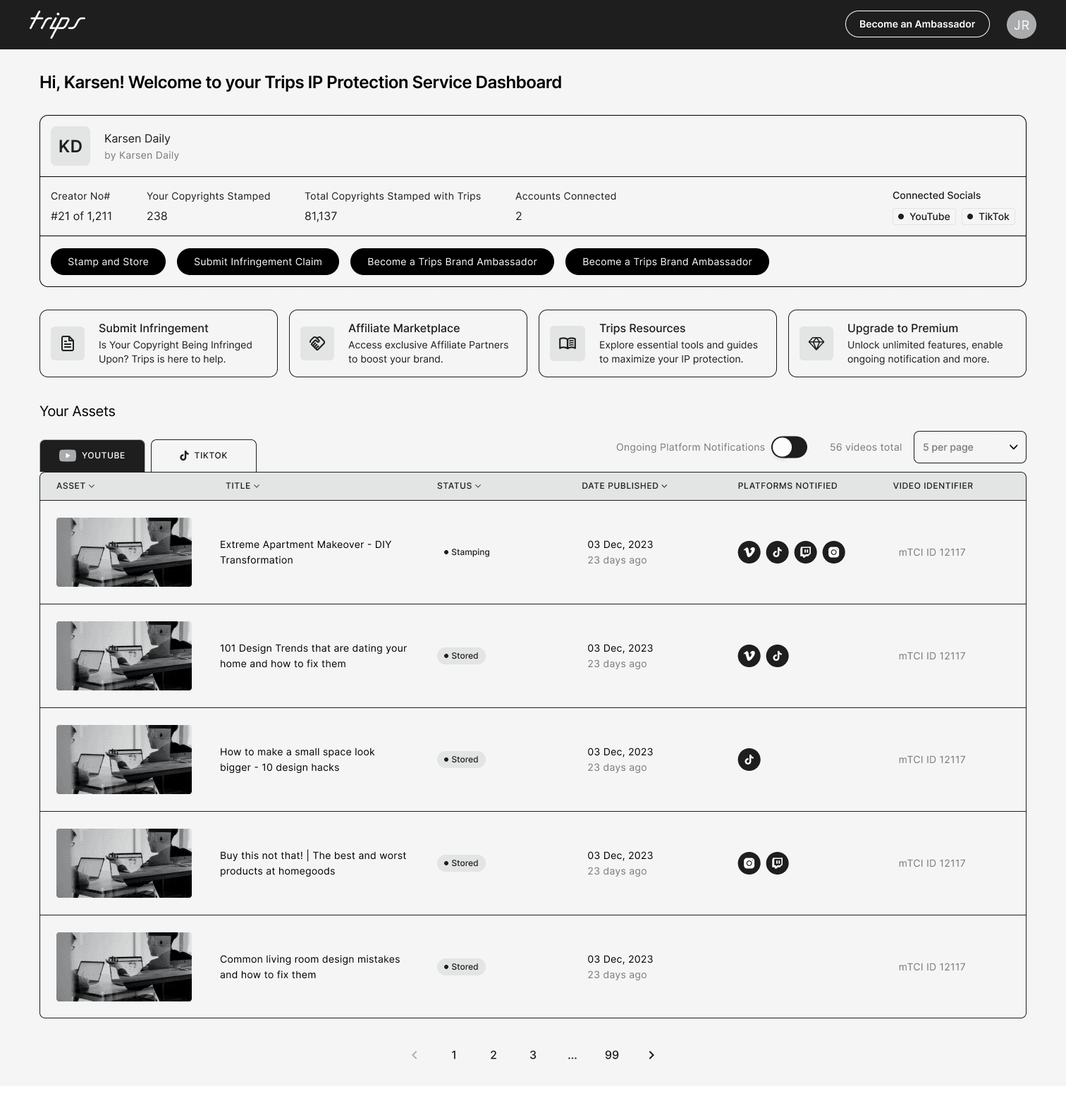
Based on this feedback, we went back to the drawing board and redesigned the dashboard to guide the user as opposed to informing the user.
The Dashboard (V2)
Whilst implementing the feedback from V1, we also considered.
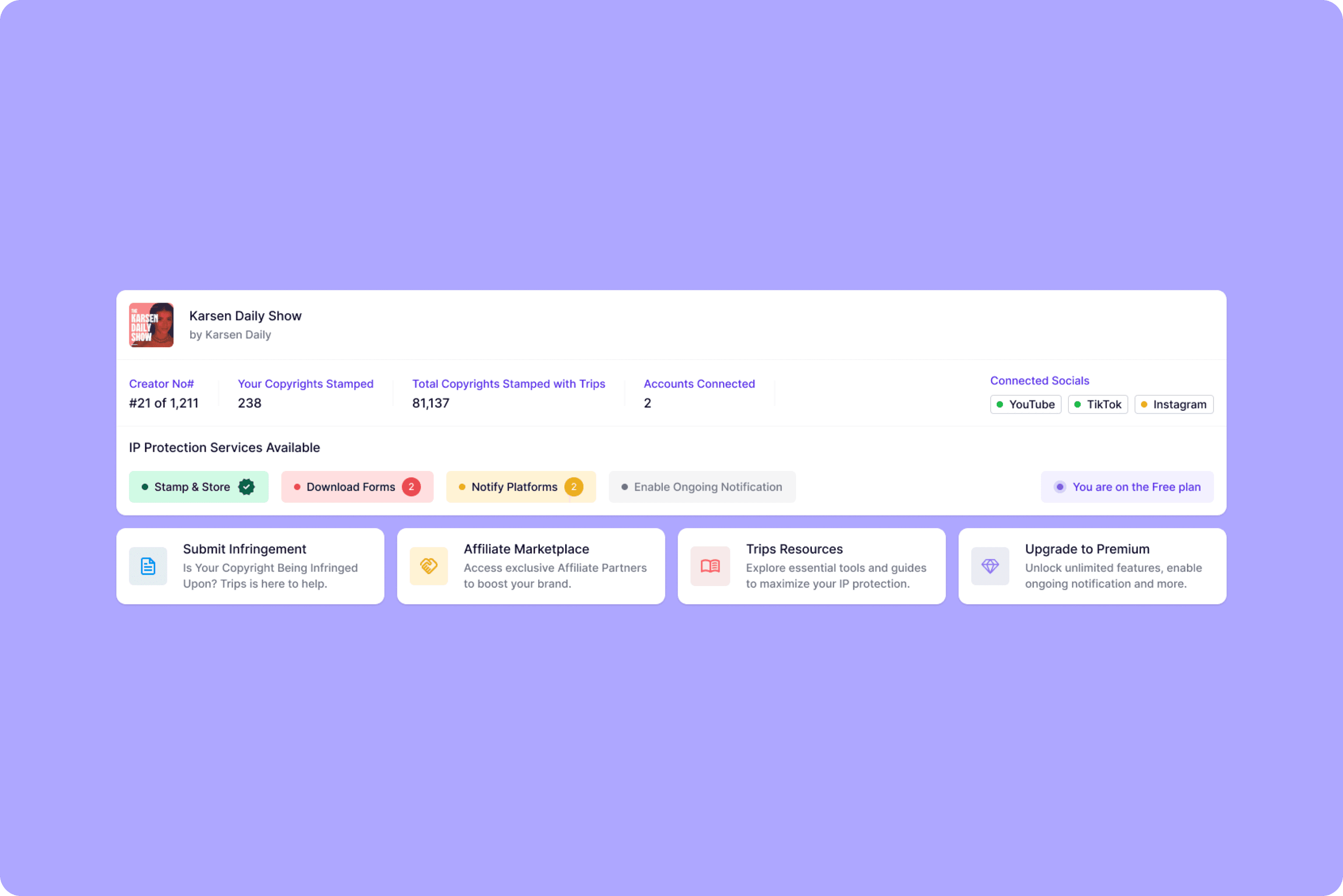
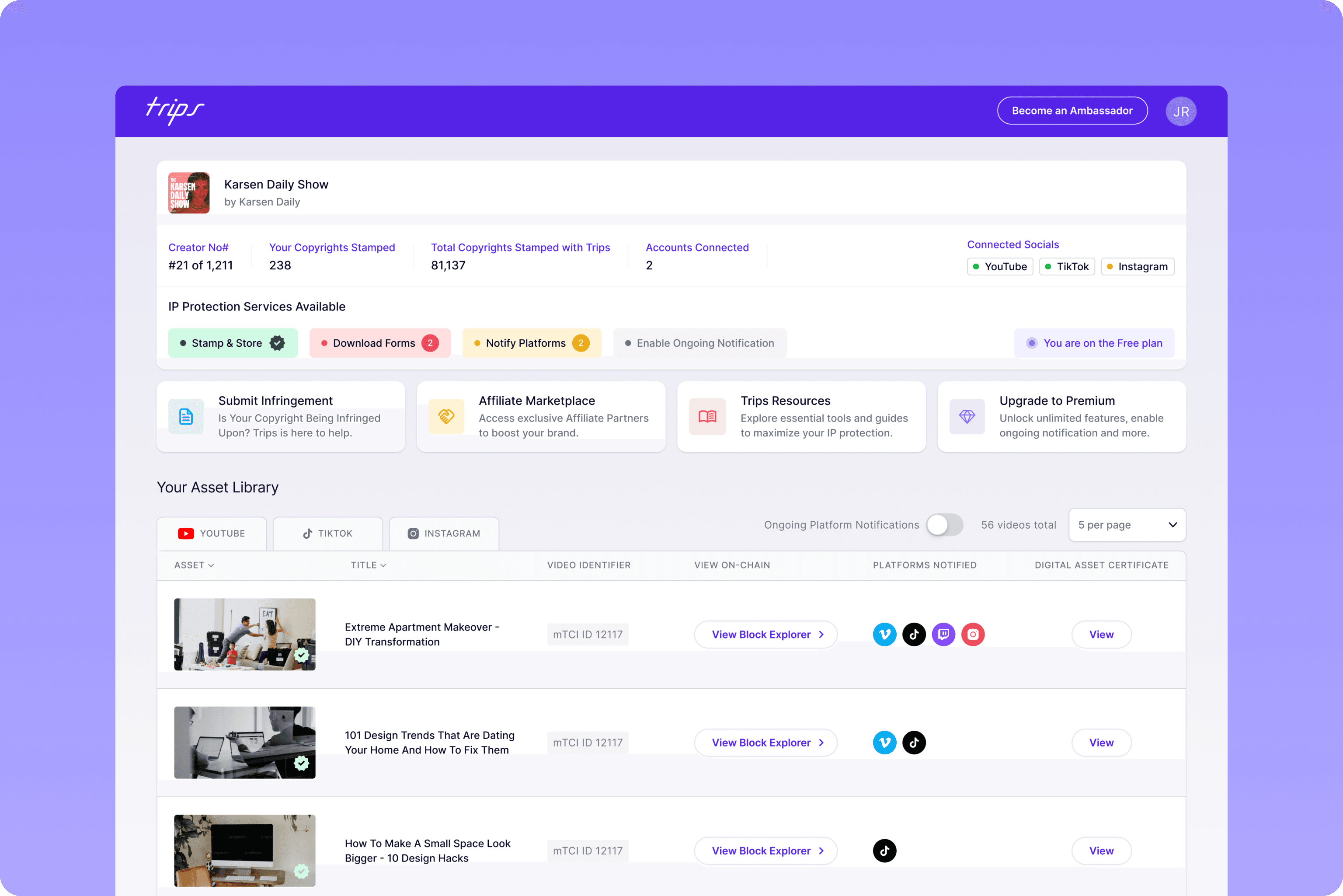
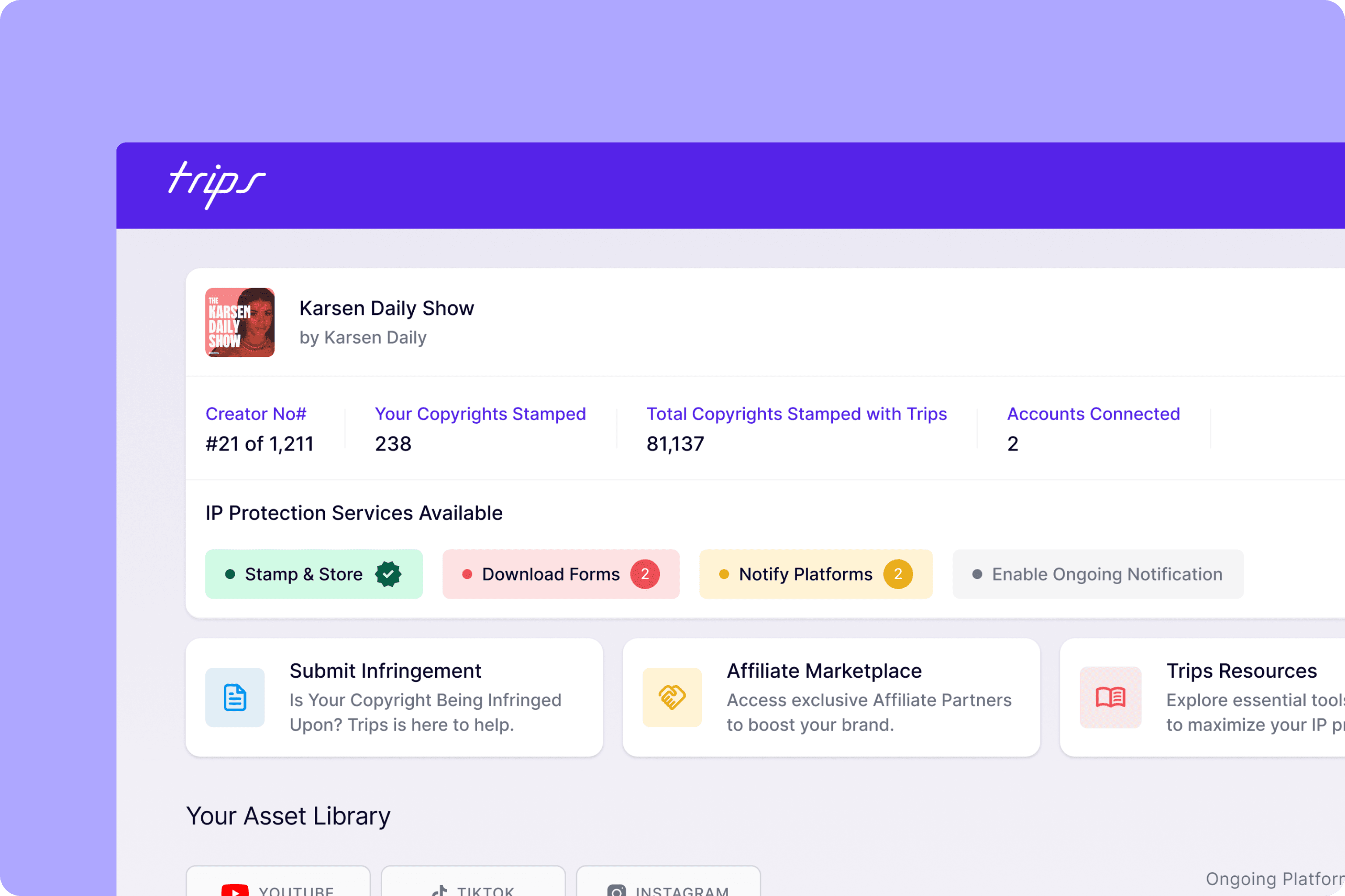
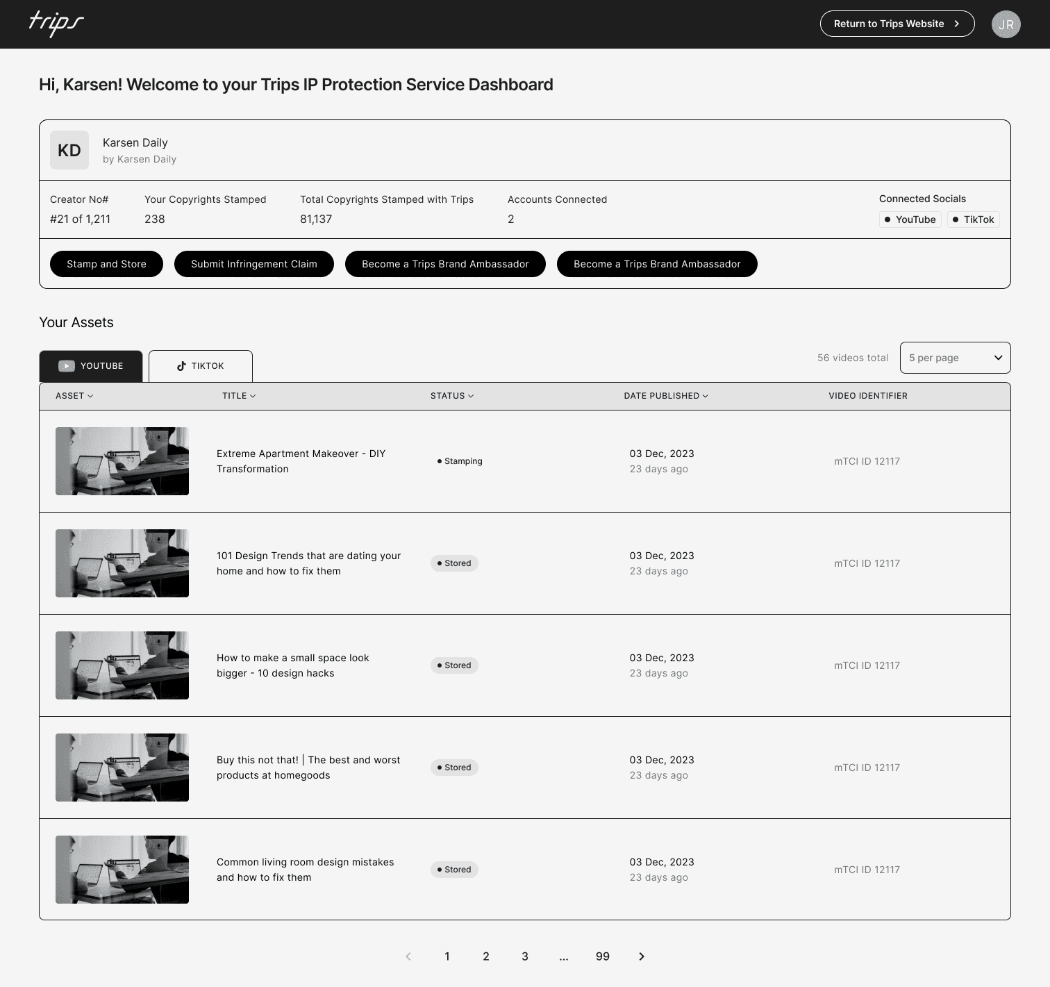
The number of components on the dashboard: Millers Law shares that users can only really focus on 7 items on a screen (plus or minus two) so this was a consideration when mapping out the items we wanted on the initial dashboard screen. The trips dashboard is comprised of 6 cards, all containing information that will helps them engage or help guide them.
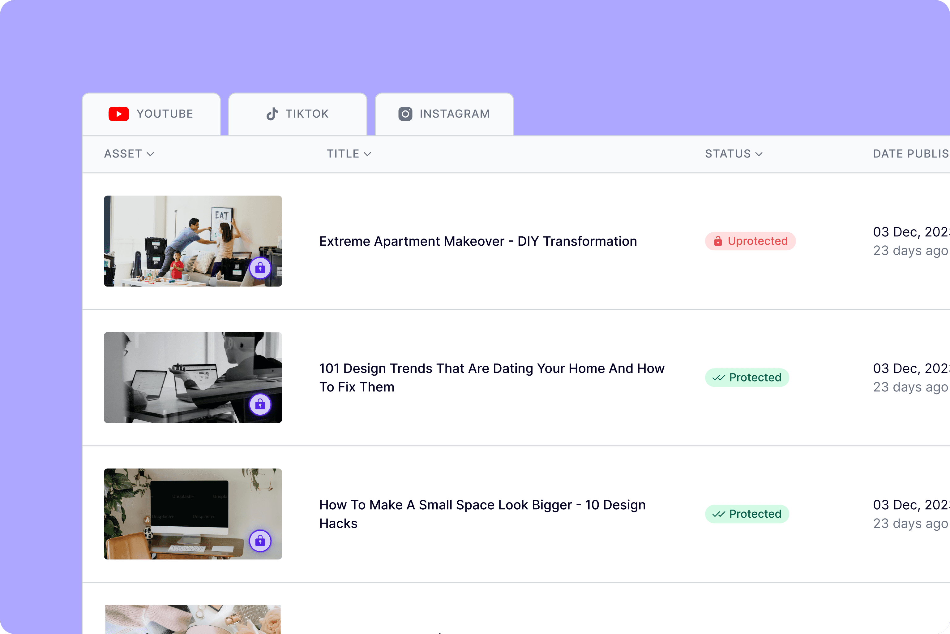
Colour theory: We introduced the traffic light colour system to ease the understanding of items that needed action now or later which will again, encourage users to engage in any outstanding task. The shade of red used is the same shade used across Instagram and TikTok so there is a sense of familiarity when it comes to the behaviour required when this colour is shown.
Information hierarchy: The 4 cards sandwiched between the header and the table are also ordered in a specific way that will hopefully engage users in the interaction we need the most. According to The Serial Position effect, users remember the first and last item in a series which is why we placed the 'submit infringement' and 'upgrade to premium' call to actions at ether end. The lesser important CTAs are then placed in-between.
Feedback
The revised version of the dashboard was warmly welcomed by the focus group and was described as "so much more user friendly" and users were "excited to start using this version".
Prototyping
Once all high-fidelity screens were approved, we worked to build a prototype that could be used as a demo for investors and also for any customers that wanted an insight into the brands upcoming features.
Final
05
